Your Brand VS Web Accessibility Color Contrast Rules

You’ve created this beautiful chic brand with delicate colors. It fits your company persona and the target consumer culture perfectly. Now you’re ready to create the website of your dreams that will make you a zillionaire! But wait… your web designer informs you that your brand colors don’t have enough contrast for WCAG 2.0 accessibility and that your brand colors need to change! Wait! What?! This will change your whole brand’s look and feel!
More than a few people out there out would just ignore these rules and push forward. If you’re a company with under 50+ employees, you technically don’t have to follow the accessibility laws. But I’m going to explain to you why you should not ignore the WCAG 2.0 color contrast rules and – more important to the business owner – how this does NOT have to compromise your brand look and feel.
It’s not just for disabled people!
No, these rules aren’t just for disabled people – they’re actually based on some solid common sense. Let me explain. Do you have trouble seeing your smartphone screen in the sun? Have you ever noticed how one color looks lighter or a completely different shade on your computer screen than someone else’s screen?
We can’t control where or how someone is looking at your website. The type of device, the screen’s lightness/darkness settings, screen quality and where the device is being viewed all makes a huge difference to your site’s appearance. Under certain conditions, your chic branding might be completely illegible if there’s not enough contrast. You may think your website brand looks soft and sexy with all those muted tones, meanwhile, a customer viewing it on their phone outdoors may be squinting trying to figure out if there’s something on the page at all.
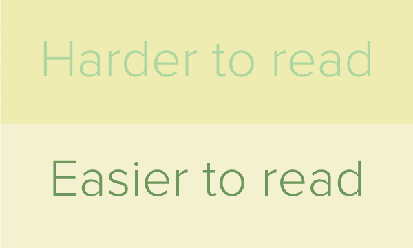
This doesn’t mean that you need to totally abandon your branding to a stark black and white. What it does mean is that you may need to adjust your branding, by adding some contrasting tones to your color palette. In some cases, your colors may only need a small tweak to hit the recommended color contrast values. Adding darker/lighter versions of your brand colors will allow your site design to be viewed in any situation while keeping the integrity of your brand. By all means, keep using those muted tones, but use them in areas that won’t lead to legibility issues.
What are the WCAG 2.0 Color Contrast rules?
Glad you asked! The WCAG 2.0 has three levels A, AA and AAA. Level A is already law so let’s focus on Level AA, which should be your current website goal as it will come into effect in the near future. Color contrast rules are actually fairly difficult to understand. They describe color contrast ratios and relative luminance, etc. Even seasoned designers shiver at having to read through this documentation. So let me break it down for you and give you some easy-to-use tools.
WCAG 2.0, Level AA: Ensure that a color contrast ratio of at least 4.5:1 exists between text (and images of text) and background behind the text.
This success criteria describes the minimum contrast needed for text that is less than 18 point (if not bold) and less than 14 point (if bold) vs. the background. If you want to push to WCAG Level AAA your contrast will need to be 7:1 minimum contrast ratio.
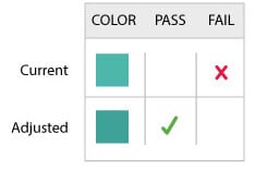
Ok wait… How do I KNOW if my color combination is 4.5:1??
Well for those of you who love numbers, the calculations can be found on the WCAG 2.0 document site under G18. I’m not one of those people, so luckily there are a lot of tools that will help quickly determine what colors work together and what ones don’t.
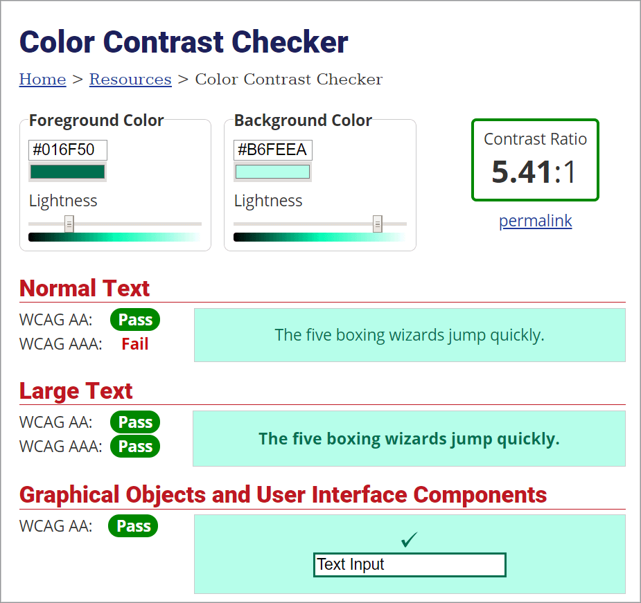
The WebAim Contrast Checker is a very simple tool that allows you to check the ratio between your background color and your text colors. As you move the color slider left or right you’ll see in real-time how it affects the contrast ratio. It also very clearly displays what color combinations pass and fail each rule.
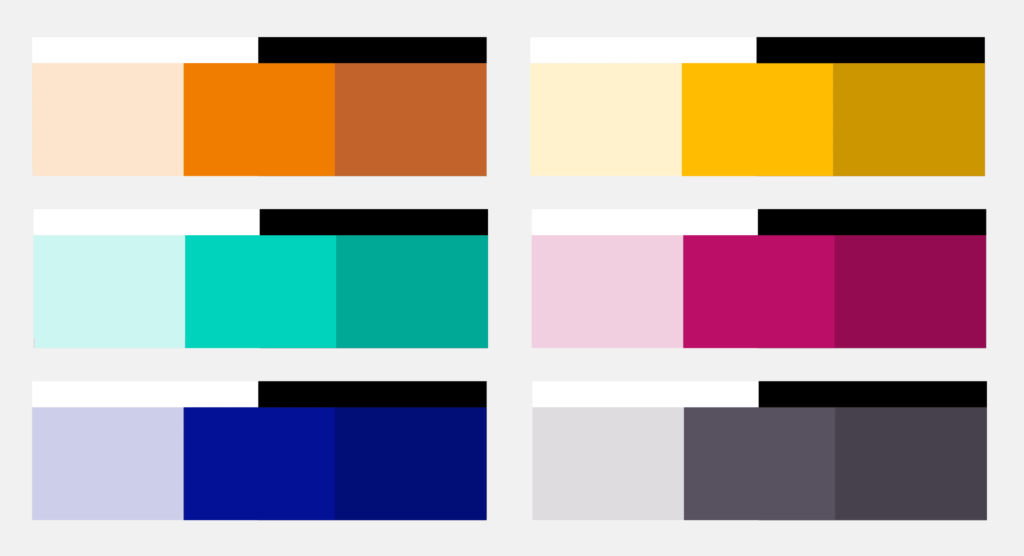
Another very handy tool is the Contrast Checker. It allows you to input your foreground and background colors or upload an image to check against the WCAG 2.0 rules. A great feature of this tool is that you can save your color combinations in the history. This way you can create multiple options, then save the page as a PDF or use the share button to send your options to someone.
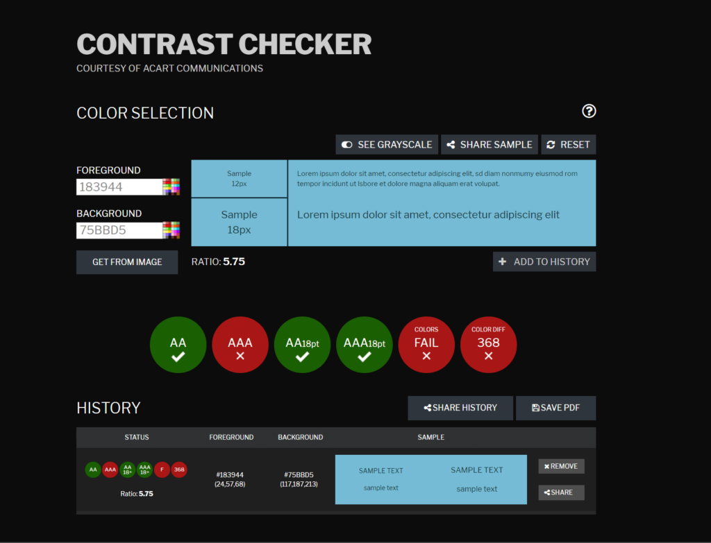
Another useful option with this tool is that you can test how the color contrast transforms into grayscale for the fully colourblind.
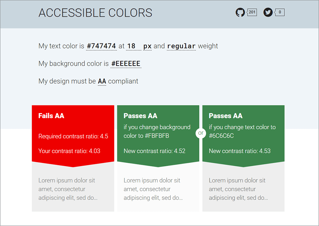
Accessible Colors is a nifty little tool that helps by suggesting changes to your colors to help you become compliant. It allows you to input your text specifications, background color and the level of WCAG 2.0 accessibility you want to pass (eg. Level AA). If it fails, it gives you color options for you to consider.
Now that we’ve figured out how to evaluate color combinations that fit the WCAG 2.0 text rules, let’s move on to non-text items!
The visual presentation of the interface components and graphical objects have a contrast ratio of at least 3:1 against adjacent color(s)
For the full rule, you can visit the WCAG 2.1 understanding non-text contrast page. But for now, let’s break this down a bit.
Interface components, like menu items, form fields, and buttons, need to have a contrast ratio of 3:1. This rule also includes their various states. For example, if a button changes color when it’s being hovered over or clicked, it must still maintain the contrast ratio.
For graphical objects, this rule only applies when the graphic is essential to the user’s understanding of the surrounding content. For example, a pictogram showing how to accomplish a task or an icon of a phone beside a number.
This is another area where the color contrast checkers will come in handy, but there are also some other tools that will help.
The Color Contrast Analyzer Chrome add-on allows you to choose a level of conformance, then the scanning process will output a ‘map’ of where the edges between the colors meet the criteria. Any items that are not outlined in white don’t have enough contrast. The results can be downloaded to your computer as a png file.
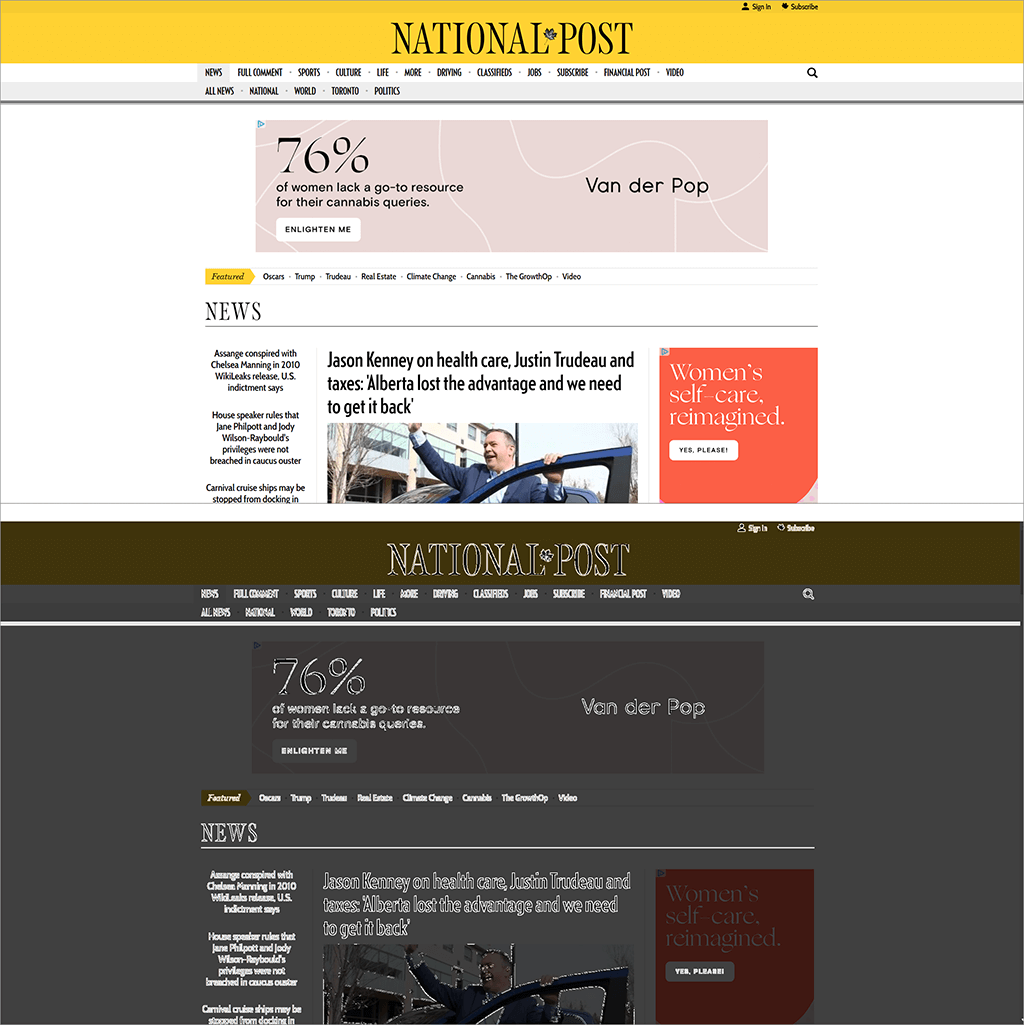
In the example above, you’ll have noticed that there are certain elements that don’t have enough contrast. Since these items aren’t integral to the understanding of the content of the site, they don’t need to be changed.
Another very useful Chrome add-on is Funkify – Disability Simulator. This allows you to see your site in many different situations and with many different disabilities. For example varying degrees of color blindness, blurriness, bright sunlight, age/mobility issues, reading and writing or concentration issues.
Remember that if you or your client insist that a light color must be used for an item, (for example a button or form area), a simple darker outline could be all you need to make the design compliant. These changes do not have to be intrusive to the brand or design of the site. This is where hiring a professional web designer can really pay off in both time and aggravation.
High Contrast Versions
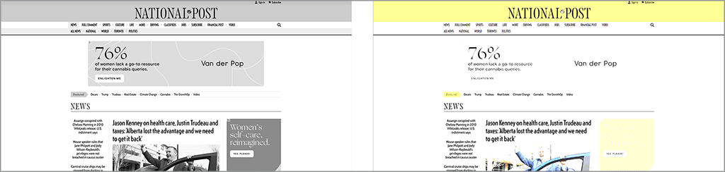
Now that we’ve touched on these major color rules, I bet you’re wondering why you can’t just have a button that switches your site to a high-contrast version.
While technically you can add a button for a high-contrast version of your site, it’s really not very practical. Your website design would need to include a highly visible button at the top of all pages, drawing attention to the fact that there’s a high-contrast version. If that isn’t enough to put you off, the extra development cost might. If you’re going to go this route, you’ll want to spend some time making sure that this route makes sense for your audience.
The laws may apply to you in the near future
We all know the reasons behind the accessibility laws – to give disabled persons the ability to do anything on the web that a non-disabled person can do. If you’re a new or small business right now, you probably don’t fall under the current accessibility laws, and you may not feel you have a customer base that contains many disabled persons. If you start thinking about your business in the future, you might change your mind. You could soon find yourself with a much larger business than expected, and there is always the potential that the laws may change to cover smaller businesses. If you follow these laws right now, you can save yourself the cost of brand development and web redevelopment later.
Hopefully, I’ve given you enough information to alleviate your fears about keeping your brand intact while making your website colors WCAG 2.0 Level AA compliant.
Want to know more about accessible web design? Read my last post “Is Accessible Design Ugly?” or the next post in my accessibility series called “Innovative but Inaccessible“.
If you have any questions or would like to hire us to help you design and develop a fully accessible website, contact us today! 1 (905) 852-2615