When UX Fails

Have you ever been confused by a website layout? Unsure how to navigate to what you want? Inundated with confusing graphics, content or menus? Trying to fill out a form doesn’t work on your mobile device? The page loads so slow that you give up and leave in search of something better? Chances are you’ve encountered one or more of these. This is where UX fails.

UX stands for User Experience. When we talk about UX in web design, we’re talking about the HOW of how users use the website. This includes the design, the content, the accessibility, and screen size adaptability. It should not be left to the user to fix their device settings in order to navigate your website.

The Top 7 most common UX fails:
1. Assuming your users are expert computer users.
The level of computer knowledge should not be a barrier to your visitors. Items such as hidden navigation can cause huge issues among even seasoned users.
2. Assuming your users already know your products and services.
Never assume, and always design for the lowest common denominator. Generally a website’s purpose is to market to potential new users – so you need to ensure that your website fulfills the needs for both potential and seasoned users.
“Most companies design their sites based on THEIR perception of their products or services, instead of how the customers understand the problem they need solving.”
Larry Marine, Director, User Experience, Intuitive Design
3. Not leading with the most critical content
Big images at the top of your site are really cool… but hiding your most critical content ‘below the fold’ (add to terms page and link) has a number of issues – Not everyone will find the sparse brand messaging compelling and the biggest issue, not everyone will understand they need to scroll down to see the rest of the content.
4. Slow page load
You might not think of optimizing your page loading speed as “UX”, but it definitely affects the user experience in a major way. Every element placed on a page affects performance and there is a direct correlation between page load times, and conversion rates.
“Walmart.com found that, for every second of improvement, they experienced up to a 2% conversion increase.”
Tammy Everts, Senior Researcher & Evangelist, SOASTA
Ensure the graphics you upload are optimized for speed, and device size, and that your JavaScript, CSS and other external files are minimized and loaded only where necessary.
5. Not focusing on how you’re talking to your visitor
Not everyone will understand your business’s jargon, or company-focused content. To get and retain new customers, you need to build your website in a way that captures and educates new visitors. That means using their language – the terms that they use to describe your business – in order to rank in search, capture their attention and then you’ll have a chance to educate them.
Not everyone will understand your business’s jargon, or company-focused content. To get and retain new customers, you need to build your website in a way that captures and educates new visitors. That means using their language – the terms that they use to describe your business – in order to rank in search, capture their attention and then you’ll have a chance to educate them.
‘Joe’ business owner may say “But customers call my business ______, when the proper term in the industry is _______.” It’s great that you’re able to identify things like this because now it can then be addressed within the content of your site. If no one knows or searches for that ‘proper’ industry term, the less likely you’ll be found, and the less likely that when you are found, that they’ll stay. Does it take longer to write content – yes – but stay focused on your two huge benefits, SEO search ability and lowering your bounce rates.
6. Not testing your site on multiple screen sizes and browser technologies.
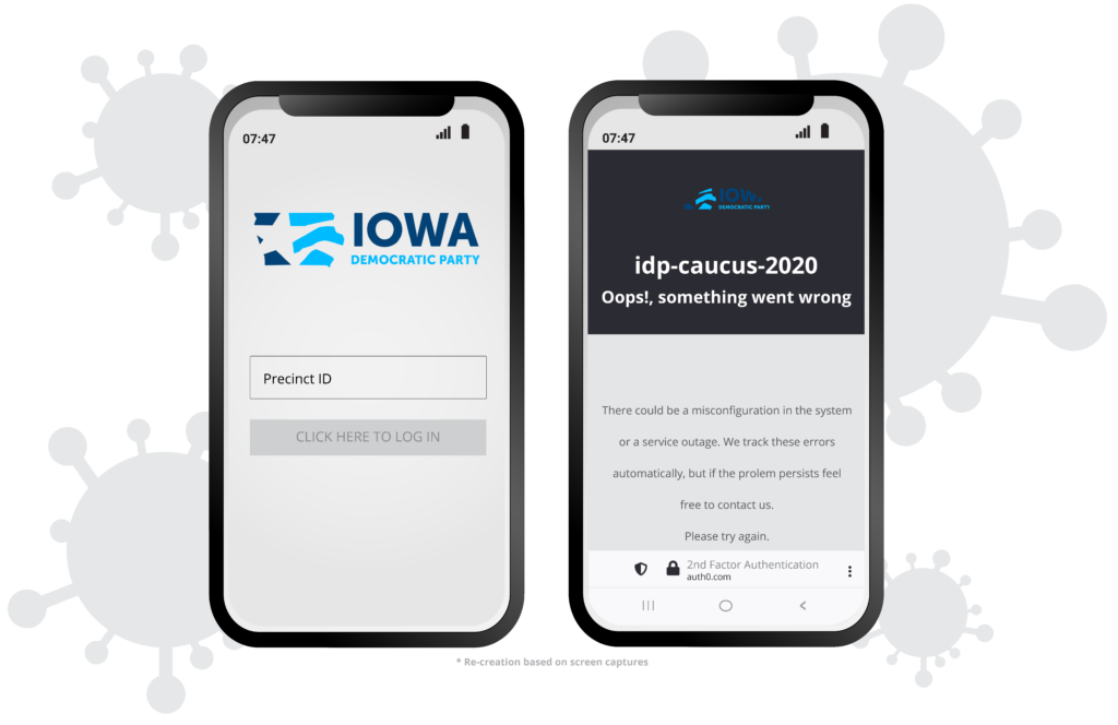
If you’re not testing your site on multiple device sizes and browser technologies then you’re going to be in for a rude awakening. What looks fantastic in Chrome browser may look like a dog’s breakfast in Internet Explorer. Or what looks great on a desktop, may be completely unusable on a cell phone. Not fully testing your UX can have disastrous consequences, not unlike the Iowa Democratic voting app debacle.
“..a DHS official told POLITICO on Tuesday that it had not vetted or tested the app. And acting Homeland Security Secretary Chad Wolf said on Fox News that his department’s Cybersecurity and Infrastructure Security Agency offered to test the app “from a hacking perspective,” but “they declined.”

“The modest sum of money paid to the app provider over a couple months, the absence of any meaningful testing and the poor system performance on caucus night shows that ‘you get what you pay for,’” said Eddie Perez, global director for technology development at the OSET Institute, which advocates for open-source election systems.”
politico.com

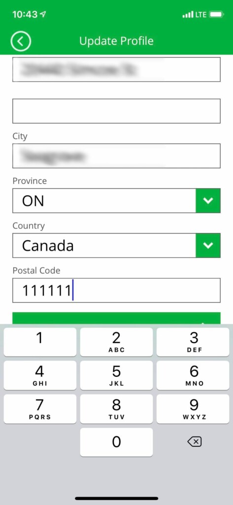
Thorough testing helps to identify issues such as the Green P Parking App that only allows numeric entry for the Canadian Postal Code. This could have been easily caught and remedied before implementation.
7. Not simplifying form fields
When your business relies on your website contacts, or sign ups, or the ability to give you valuable information through a form, it’s imperative that you make the process as simple as possible. Here are some things to consider:
- Use a social signup. Social signups can significantly increase the number of new signups (up to and estimated 40%), and streamlines the signup process.
- As few fields as possible. Forms with less than 5 fields usually convert the best.
- Eliminate distractions, ads, videos, links, to distract users from the signup process.
- Use copy to give the users additional reasons to do the work to fill out the form.
- Allow autofill for much faster data input in common form fields.
- Evaluating how the input process changes on small screen devices.
- If your form MUST be long, it helps to break it into smaller steps. Also ensure users can see where they are in the process.
- Ditch the Captcha. While it reduces spam, it’s annoying to users and it really shouldn’t be put on the user to prove that they’re real.
How do you know if your UX is bad?
If you’re using Google Analytics on your site you should be able to see things like Bounce Rate and average time on site. If you have a high bounce rate ( 26-40% = excellent, 41 – 55% = average, 56 – 70% is higher than average, 70%+ is bad) and a low average time on site. (industry standard is 2-3 minutes). If you’ve recently
Step 1 – TEST! Give your site to multiple people to use on multiple devices to try and identify if there are any usability issues. Pay attention to loading times and whether buttons and fields can easily be used across all screens.
Step 2 – Use heat mapping software like Hotjar, Mouseflow or Crazyegg to help you actually see what users are doing and possibly identify some usability issues.
Step 3 – Evaluate your copy. Is it easy to read and understand? Have you written it at about a grade 8 level? You may want to run a Flesch-Kincaid test on your copy to see how difficult it is to read. You should be aiming for a score of 70-80.
Step 4 – Still stuck? Hire a professional! We fix bad UX on a daily basis. With our combined years of experience we can quickly identify and propose changes to fix your issues. Contact us today to find out more about how we can help your specific issues.
Hiring an expert in UX is the most efficient use of your time. We all know that after seeing your own work many times, we tend to go “blind” to certain elements. An expert can give you not only an objective outside point of view on the UX, they may also give you insight into your customer behavior that you may not have taken into account. It’s insight like this that can help you increase the value of your website to your users and lead to more financial returns for your company. If you’d like more information on how we can help you with your UX. Contact us at [email protected] or 905-852-2615.
Sources:
https://sitetuners.com/blog/6-common-user-experience-design-fails-that-make-ux-experts-cringe/
https://www.theguardian.com/us-news/2020/feb/04/iowa-caucuses-delays-smartphone-app
https://www.politico.com/news/2020/02/04/iowa-app-caucuses-2020-election-110710