Website Design Trends for 2020

We’re on the cusp of 2020 and the internet has had quite a year. Data breaches, government spying allegations, GDPR, and many other data and security issues have been massive topics surrounding the web this year. This year was also a landmark year to push accessible websites further to allow for greater usability across barriers. How does all this affect the website design trends going into 2020?
Let’s look at the upcoming website design trends for 2020. From bespoke, minimalistic design, to designing for accessibility & data security, we’re going to tackle it all! It’s a long post, but it’s worth it, I promise. And I want to hear your thoughts! Do you agree, disagree?? Please stick around and add your thoughts to the comments below.
Font Trends:
Oversized lettering
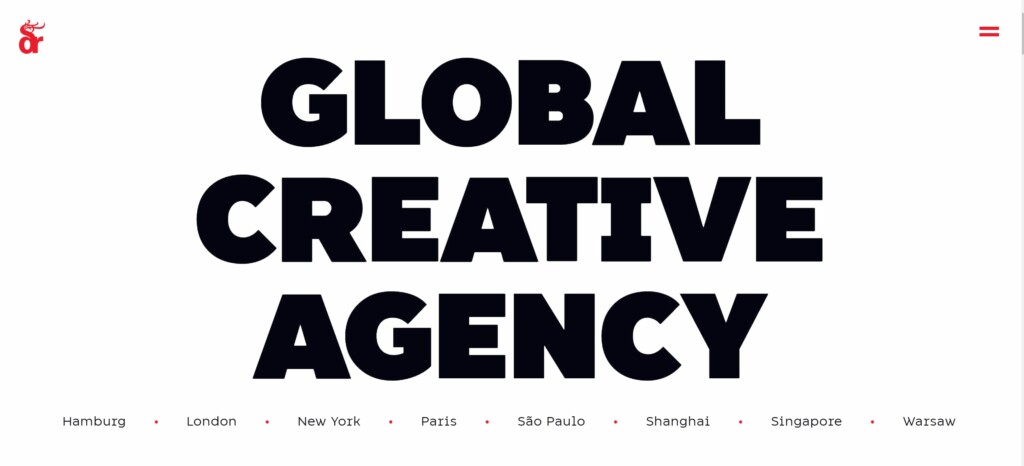
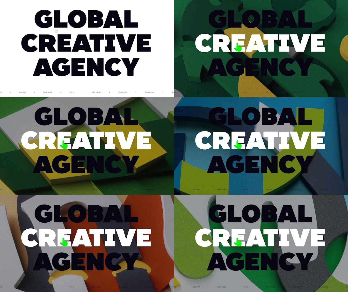
Loud and proud typography. Seriously SUPER large. Now this website trend is not for everyone or every brand. This needs to be a well thought out application and it’s easy to overdo this and make the site clumsy and chunky. For example – Dragon Rouge is using huge text and a massive green mouse arrow. When hovering over the word “Creative” all hell breaks loose… and not in a good way. It’s like an unexpected techno dance starts and the user is bound to lose focus. As you scroll down there is no escape from the giant text and flashing background. This is overdoing it.
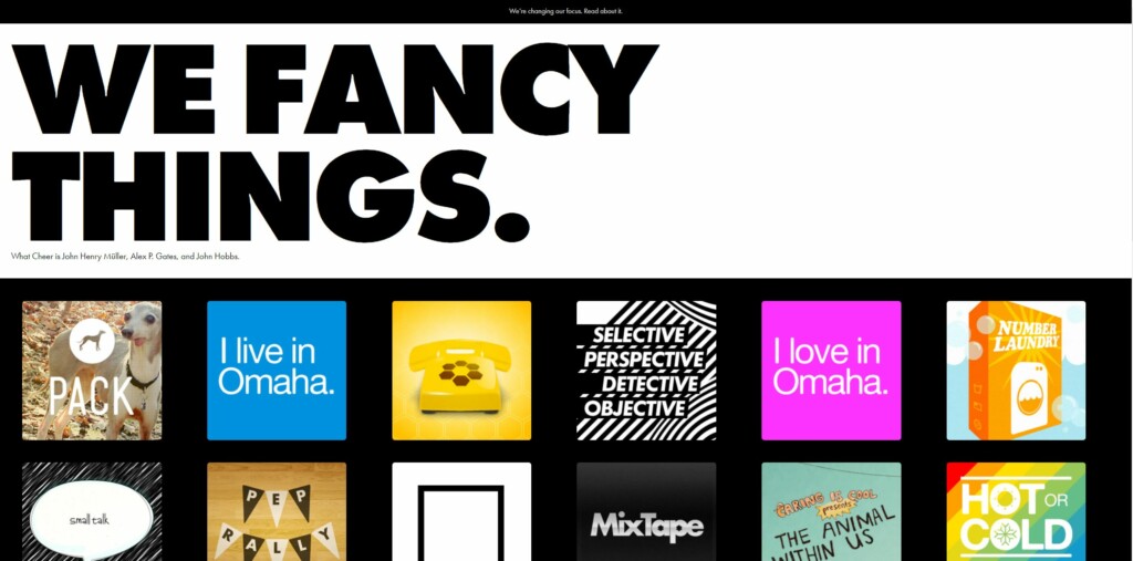
On the other hand, “What Cheer” is a more satisfactory example of the use of large text followed by a relatively normal sized elements. Even though this has more content above the fold it actually has a more attractive, engaging and less claustrophobic feel then Dragon Rouge.
Variable Fonts
Variable fonts are coming on strong. A variable font is a single file that acts like multiple fonts and can improve page-load times. For example, the variable version of Acumin contains all nine weights in one file.
This allows us to animate the text itself without needing SVG or web technologies such as JavaScript or Canvas. If used sparingly, this could be a really cool eye catching element. There are some great examples on Speckboy.
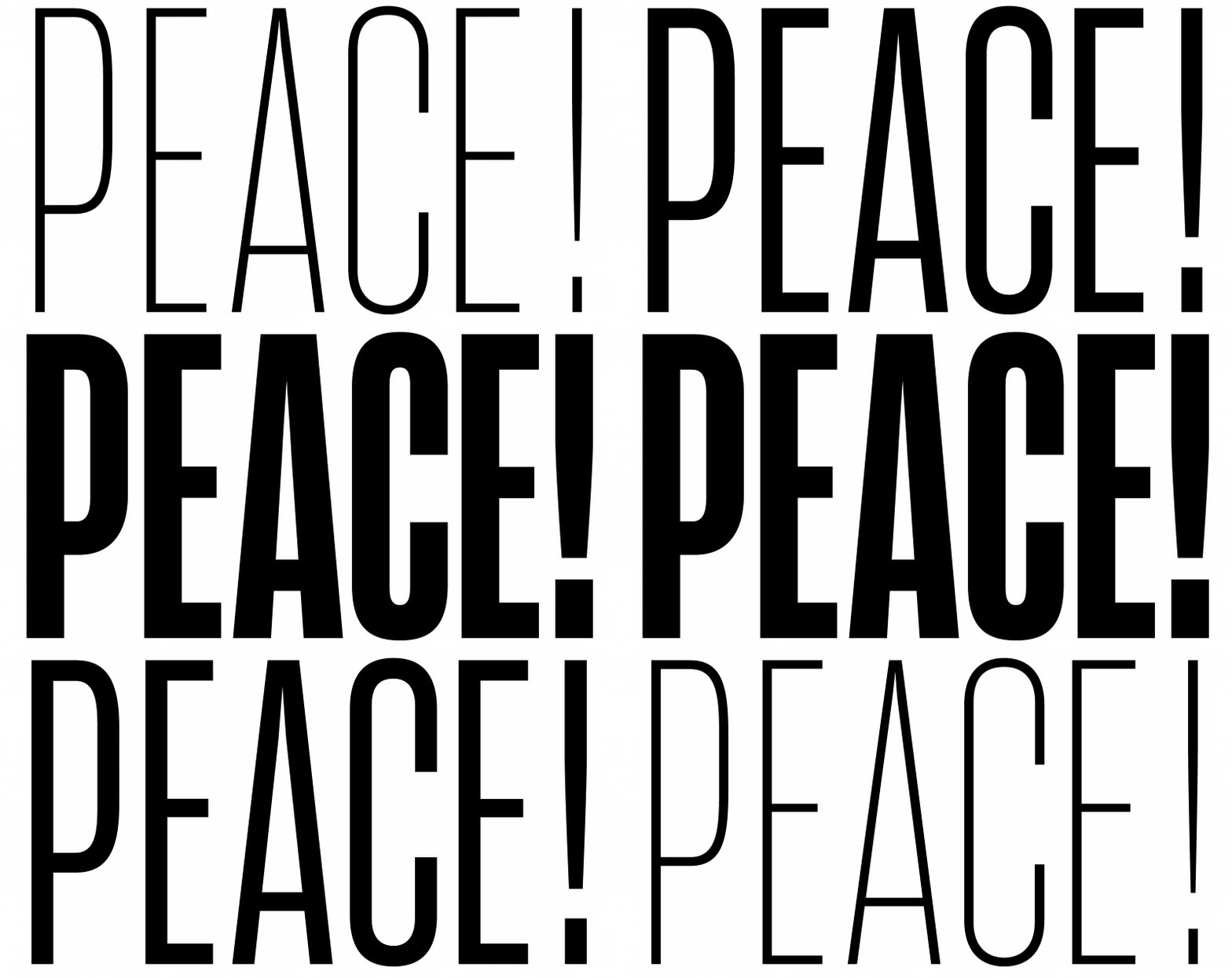
“OpenFormat is officially supporting the new trend. In fact, type designers can easily interpolate individual glyphs alongside up to 64,000 axes of variation—from width to weight and so on. So adventurous typeface designers will have a wide variety of options to play around with and flourish.”
Sondora Marketing
- OpenType fonts give you the ability to animate text, while still being accessibly readable text.
- You can use CSS keyframes and font variation settings to animate your text content.
- Variable fonts can change more than just font weight. Depending on the font, you can change extenders, and serifs. There are even short anamorphic animations like a horse running.


The CSS for animating Variable Fonts is now widely adopted, so you can use almost all of the features without worrying – but with all new code, you should check browser availability on caniuse.com
Caution: it’s extremely easy for your design to become a gaudy over-animated mess. Remember, less is definitely more, and you should avoid using this for the “cool” factor. There should be a well thought out design & marketing case behind the use of this.
Website Layout Trends
Bold colors & Minimalism
Super saturated colours, brilliant and deep colours. Simple design, oversized text, contrast text colour. Vibrant colour schemes are effortlessly capable of seeking user’s attention. It can enhance the aesthetics and visual appeal as well as improving user interaction rates.
“Use of intense colors increased web recognition to around 80%. Websites that use dark colors experienced 2% of growth, whereas light color themed sites experienced 1.3% growth.”
SAG IPL
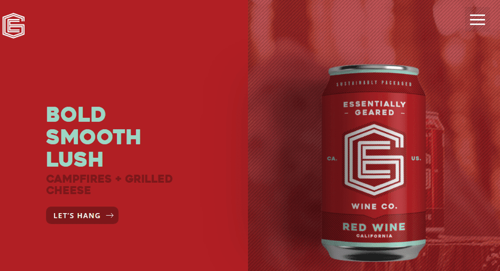
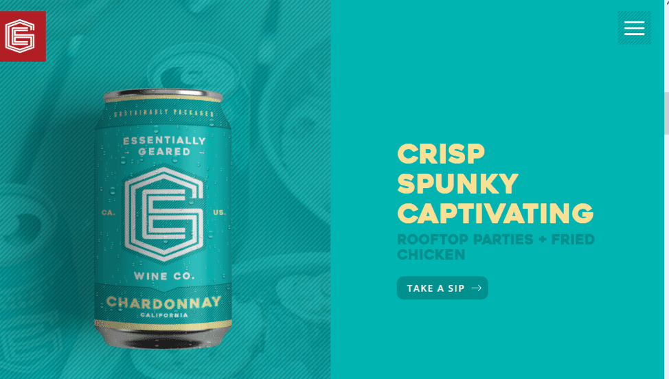
There are many ways to create a site with a minimalistic look.
- Hidden navigation: While it does make it does make it difficult for users to find the menu – it hasn’t stopped this from becoming a trend. The hamburger menu is controversial – with some people loving the simplistic minimalism of it, and others citing that it can be hard to find and recognize as a menu.
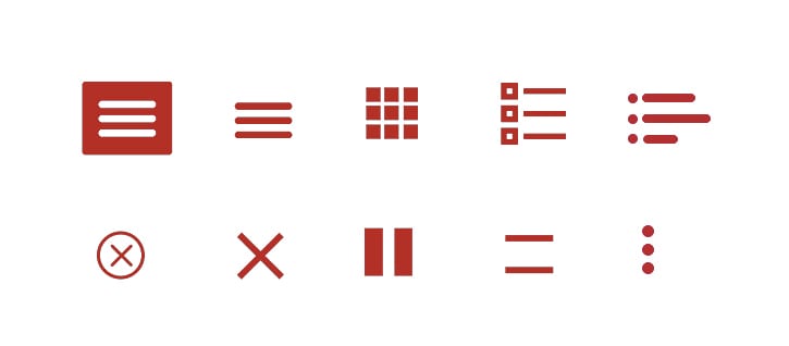
- Minimum of colors: Using a limited color palette helps simplify the website look & feel.
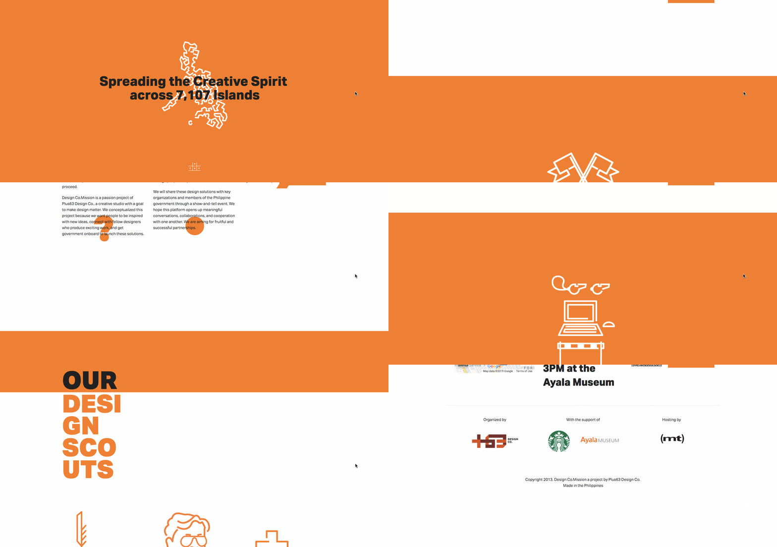
- Lack of additional details and shadows
- Lots of whitespace
A minimalist web-design strategy is one that seeks to simplify interfaces by removing unnecessary elements or content that does not support user tasks.
Generally a minimalist website improves site loading speed and responsiveness. As well, they are usually simpler to navigate.
Some things to keep in mind when creating a minimalist website:
- The lack of content can make it more difficult to rank on keywords.
- If using a hidden or minimalist menu, you should carefully watch your analytics and ensure that your users are finding their way through the site. A high bounce rate or a lack of users finding their way past the landing page may signal that they’re confused and are unable to go further into your site.
Parallax Web Design
Parallax effects use layered graphics to create the illusion of depth as the user scrolls down the page. Some say it’s still relevant, some say that it’s an outgoing trend. I think it’s safe to say that the large 1 image parallax scroll is dated, but the layered, multidimensional parallax is still a growing trend. If you are going to use this effect you should pare it with minimalism and avoid a design or graphics that are too complex.
This is yet another effect that you should use sparingly, and it’s important to test that this does not affect website speed or user experience negatively.
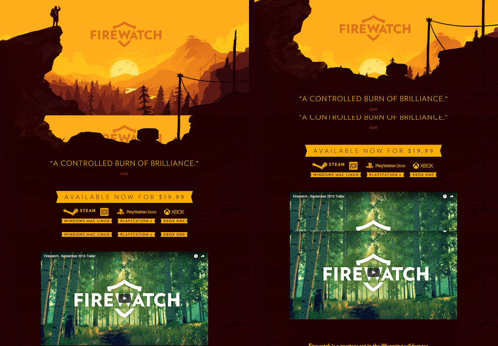
Asymmetric Layouts
Asymmetrical layouts are designs that do not follow traditional grid layouts – instead place design elements chaotically and creatively.
This website design trend style reeks of brutalism and anti-design. Vertical text, clashing colours, sharp lines, open defiance to conservative layouts – all in all – very 80’s inspired.
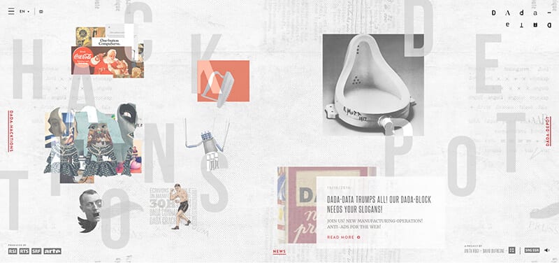
To make this type of design work, there must be an intentional use of space, imagery and color to lead the user’s eye. Otherwise the user can easily get lost in chaos. Dada Data has a very chaotic Asymmetrical site. While it does promote exploration, the excessive motion and hover states can be a little overwhelming, and can leave someone feeling a little disoriented. To use this type of design, you need to have a good grasp on the prospective audience and know that this will delight and not frustrate them.
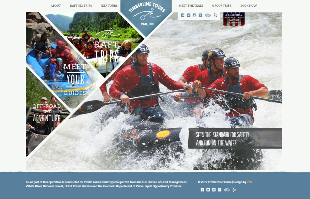
Timberline Tours takes a different route with their asymmetrical website design. The layout is clean and easy to navigate. I wish that they had overlaid the 3 images on the left with a darker colour to make the text easier to read, but the design itself is unusual and beautiful.
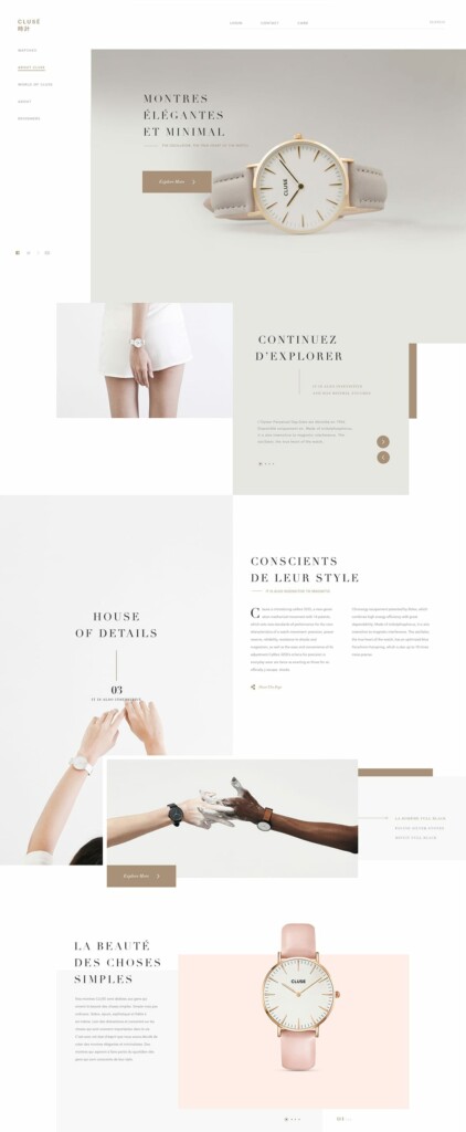
An absolutely gorgeous example of asymmetrical design that works very well is for Clusé by Mustafa Çelik. The use of white space, bespoke imagery, gentle pastel colours and refined fonts leaves the user with a feeling of elegance. The fact that there is no real visible grid to this layout doesn’t deter from the high-end luxury feel, instead it gives the webpage a feeling that the product has extraordinary quality. They’ve taken what could be a boring site about watches and made it exceptional.
Split Content
This website design trend was introduced with the aim to make better use of the visible screen space. Split screen designs let you show more than one important messages (image, text, etc.) on a single page (viewing area). But it breaks the UI rules – it gives equal importance to two primary areas.
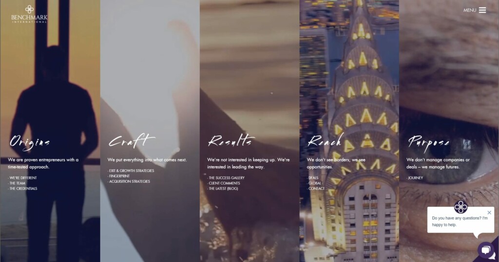
A bad example of split screen is Benchmark International’s website. The text is hard to read, the images seem somewhat unrelated and the whole thing seems a bit… well …. off. It looks like they’re trying to be minimalistic with the hidden menu and small amount of text, but the images are just so overwhelmingly busy that it fails in that endevor. Their logo has a clean, beautiful high end look, it’s really too bad that this look didn’t transfer to the site design.
One thing I’ve noticed with this trend is that companies that have tried integrating this design in the past, have seemingly quickly abandoned the layout style. Why? Because it’s very hard to do it well!
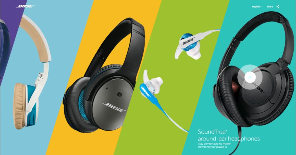
One company that has done an amazing job using this trend properly is Bose. While having 4 or more products up front on the homepage could be busy, this design makes it fun and interactive! The split screen design allows them to give each of their main products equal attention and allow the user to quickly navigate to the product of interest. It’s clean, bright, unique, interactive and it has the fun factor – this is a total win!
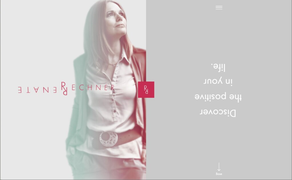
Another Unique take on the split screen is Renate Rechner. Although the loading speed should be improved, the design and animation behind this site is very unique and worth discovering.
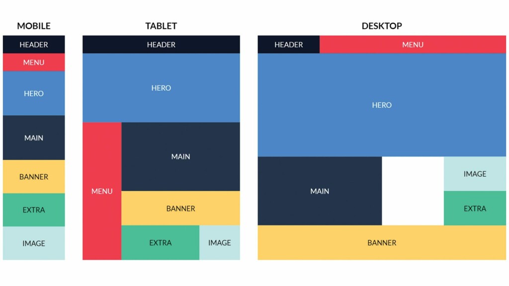
CSS Grid & Adaptive Design
Your website should be readable and visually appealing on ANY screen and this applies to ANY part of the website. The focus on small screen will push even farther into 2020 as more and more people use small screen devices on the go.
Graphical Trends
Semi-Flat Graphics
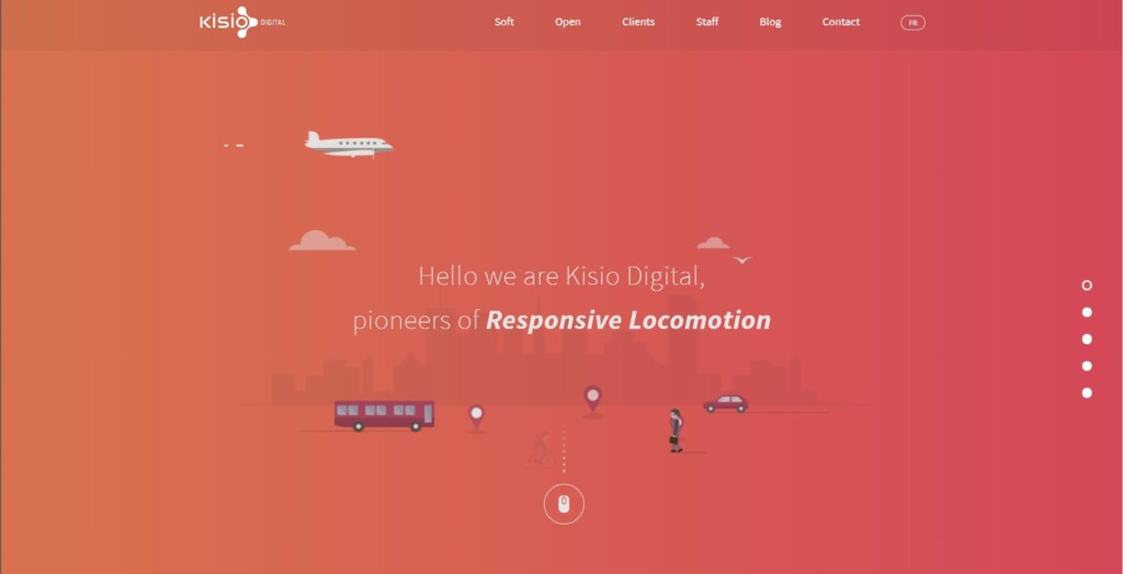
Flat design isn’t going away anytime soon – but it is transforming. There seems to be a movement towards adding some depth, giving the design a little more warm and friendly feel. It’s called Flat 2.0. It uses mostly flat elements with some realistic touches added back in like shadows and other structural complexities that don’t destroy the underlying simple cleanness of the flat design.
SVG (Scalable Vector Graphics)
SVG’s are small vector graphics that keep graphics crisp, without any pixelization, at any size. While they may not be the best option for graphics that have gradients and shadows, SVG’s are perfect for solid colour graphics.
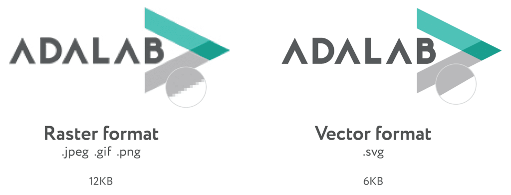
The small file size of SVG’s create a fast and consistent experience across browser technologies and device sizes.
Motion
Motion in various ways has become increasingly popular – but like all trends, this can not only become a distraction, it can also become a barrier. The download size of the interactive item may cause a slow user experience, which in turn increases the rate that people then abandon the website. Too much motion can also be distracting, annoying and can even make a sensitive person sick. So use motion sparingly, and with purpose!
Video
Large background videos, although popular, increase load times – and in many cases, animation may be a better, faster loading solution. That being said, the public’s thirst for video content is neverending. Video increases the desire for users to stay longer on a site – increasing as much as 2-5 minutes – but only if the webpage and video load quickly.
- 95% of users will stay to watch videos to explore product in detail.
- 79% said that video helped convince them to make a purchase
- 68% prefer to study using video instead of reading
- 94% of PR managers say that video helps users understand project ideas
- 84% of managers are convinced that they’ve increased website traffic due to video
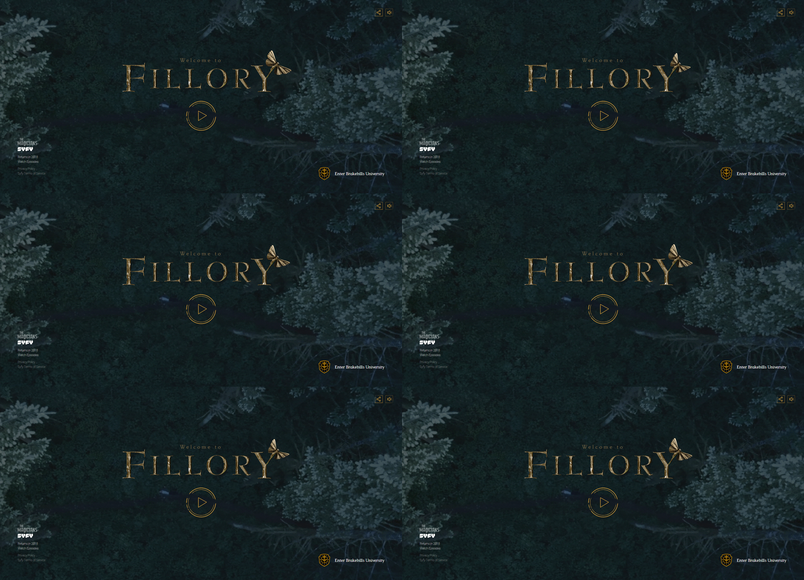
Remember – although engaging, dynamic and interactive, if you can’t keep the load time down it will kill your website traffic. As an example, Fillory website below, although beautiful, is horribly slow loading.
Cinemagraphs
They’re BACK! Cinemagraphs – otherwise known as “living photographs” are a still image in which only one or two elements move. It brings a still image to life, but doesn’t add as much bulk as a video. Studies have shown that these photos actually increase engagement rates and we’re seeing them being used more and more on social media like Instagram to bring interest to an otherwise common image.

Animation
Animation takes less time to load compared to video and it can be a fun and playful addition. When mixed with 3D or VR it can also help understand and give potential customers a more realistic view of your product.
GIF’s can quickly and effectively present visual representations of complex ideas, such as car characteristics. It’s important to note that the user’s attention span is short – so make gif’s around 5 seconds long.

Microinteractions
When you upload a file and you see the bar grow from 0% – 100% that’s a microinteraction. When you hover over a button and the color saturates or the button grows larger – that’s a microinteraction.
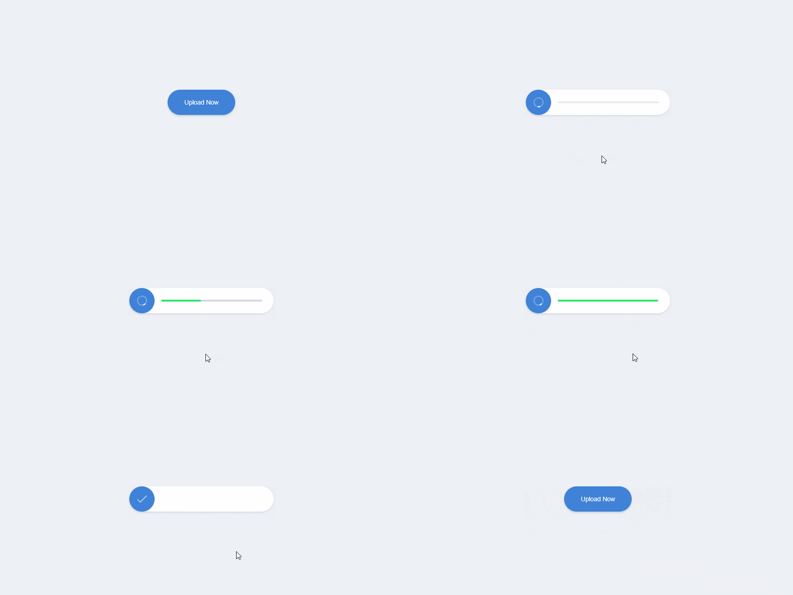
Microinteractions let the user feel what they’re doing and bring a website to life. The user is able to get instant feedback, direction and emotional validation.
CSS3 animations are a simple way to create light-weight user interactions.
Although these small animations and interaction driven changes may not seem like much, they really add up to create an immersive, engaging experience contributing to the overall user experience.
3D and VR Design
3D and VR elements help increase engagement and interest. In the past, both have been very rarely used, mostly because of the financial investment. But as technology advances, the predictions are that in the coming year, the cost to develop these interactive elements will drop dramatically, causing this to become more of a trend.
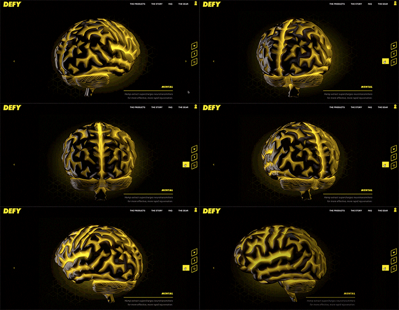
It’s extremely important that this trend does not come at the expense of accessibility, loading speed and adaptive ability.
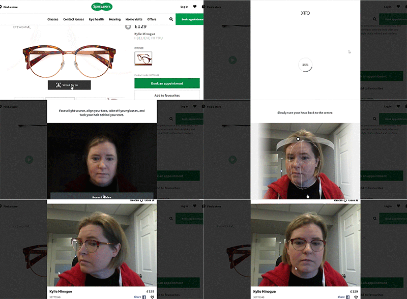
Although VR and augmented reality hasn’t really had it’s breakthrough moment, in the next year we expect to start seeing how this can be integrated into websites to create a more immersive experience for users. From being able to see all sides of a product to being able to try on products. The applications will have a mix of reality and virtual reality to help enhance the purchase experience. Specsavers’ Virtual Try On is a good example of this approach.
Illustrations & Geometric shapes
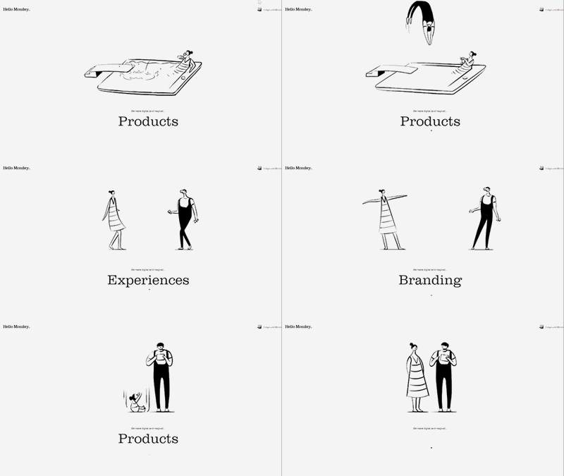
Custom illustrations – it’s not something we haven’t seen before, but it’s still a growing trend. These illustrations give websites a charming and human aspect. They enlighten, engage, enchant users.
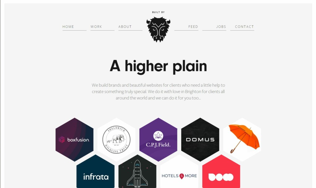
Geometric shapes can add synergy to a website. Whether it’s organizing logos into a honeycomb design like Built by Buffalo, or using different geometric shapes in the background, using unexpected shapes can give a unique structured feel. These vector shapes are lightweight elements that can really add to the website’s appeal.
Technology
User Interface
Speaking queries is much faster than typing and people are quickly adopting voice over text, Siri, Google Now and Cortana. 55% of households are expected to own a smart speaker device by 2022. This is one of the most important web design trends for 2020 and beyond. Creating a voice-capable interface will continue to grow and expand in the coming years.

How do you optimize your business for voice search?
- Ensure you have a Google My Business page. If you haven’t already, get this done. “Near me” searches are exploding and if you’re not on google’s maps, you’re left out!
- Answer Questions. The What, Where, Why, How of your business and the problems your business solves. Ask the question and answer the question. No – the questions don’t have to be an exact match. Google is smart enough now to see and serve up the most relevant results. Users are asking all sorts of questions so make sure your website can answer them!
- Use a conversational keyword strategy. Move away from traditional “keyword’ optimization to more long tailed keywords like “Our burgers are the best in Watertown!” Make variations of this in ways that people may say or ask a question with it.
- Use structured data markup. Especially helpful for products, it helps search engines understand the content relevance. Headline, price, product name, author, publish date. Giving Google a greater understanding of your content will help it be served up in more meaningful ways.
Artificial intelligence and Advanced Machine Learning
Focusing more on your user as the most important person on any website will be even more pronounced in 2020. Bad user experience is driving customers away – and you’ve got limited chances to get it right. 1 in 3 consumers will walk away from a brand they love after just one bad experience.
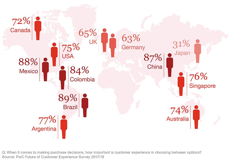
The future is leading us towards a homepage-less website, and instead, we see a movement towards more targeted personalized landing pages. Adobe Sensei is a company that has started offering advanced tools to help designers move with speed to conquer this growing trend.
“Using AI in a smart way to make your site feel more human is going to be the key to success.”
Hendrik Köhler, Sitejet
Basic ways you can add this trend to your site is having users become a member. This will allow you to collect some information and then serve up personalized, dynamic content much easier. This may sound basic and easy, but you should note, 43% of U.S. customers say they would not give companies permission to collect their personal data to allow for a more personal experience… except for one instance. For a service they truly value, 63% said they would be willing to share their personal information. So to gain the information you need, ensure you’re building both customer trust, and giving them value for their loyalty.
Security, Security, Security
There are many facets to website security that you need to be vigilant about. The first is your site’s basic hosting security, blocking spam, malware, and other malicious software from being added to or through your website. The next is your customer’s data security – what are you doing to ensure that the data you collect on your site is secure.
Security certificates (SSL certificates) are extremely important. Basically it allows sites to run on a more secure connection (https protocol) from web server to browser. Having a valid certificate helps give higher search engine ranking, and confirms to both engines and users that the site takes security seriously.
Website hosting security is no small matter. It’s important that companies invest in a good hosting company that can deal in real-time with all types of digital attacks and have security protocols in place to protect your customer database.
Accessibility
No matter what design you do – you MUST ensure that your website is both simple to use AND accessible to everyone – period. If you want to understand what is involved in accessibility, see one of my earlier posts.
“My clients are web designers, and I’m in the field of technology compliance—so the biggest trend I’m seeing is increased accessible design for consumers with disabilities,” says Sharon Rosenblatt of Accessibility Partners
“I see this for two reasons: Firstly, unfortunately, a number of website owners and businesses are getting sued for not providing accessible websites for users with disabilities—across industries like retail, food service, hotels, air travel, and more!
Right now, the Americans with Disabilities Act is being used (and has for the past few years) as a driving force to level the tech playing field and increase more access to websites for people of all abilities.
But more important is the second reason. There’s been an uptick in responsible web design and corporate social responsibility. People are seeing a good ROI and marketability of accessibility, and it’s a nice thing to advertise.
So while I don’t feel that accessibility and inclusion are trendy and stylish, I know for a fact that they will be at the forefront of designer and developer’s minds, if my inbox is any indication.”
It’s time to stop doing these things
There are some website design trends are just soooo passé! Unless there is a specific business case you should stop doing these things:
- Making single page websites. Easy to navigate but hard to optimise for search engine!
- Designing complicated / busy websites. Customers are oversaturated overcomplicated and living busy lives. Websites that are clean, easy to navigate and quickly read will attract more users.
- Writing complicated content. For example: use “near” instead of “close proximity” or “start” instead of “commence”. Making your content easy to read is extremely important. Simple wording will increase your sites ability to rank on Google, and people will actually stick around to read it!
- Using tiny fonts. Your main font should be a minimum of 16px but it would be better at 18px.
PHEW!
Thanks for sticking around! This was a LOT to take in, and we know it! We’d love to hear from you – do you agree with these web design trends for 2020? Confused? Want more information on one of these trends? Comment below! We’d love to hear from you!
Sources:
https://wishdesk.com/blog/web-design-trends-2020
https://sondoramarketing.com/blog/2020-web-design-trends/
https://create.adobe.com/2018/5/22/variable_fonts_are_t.html
https://css-irl.info/variable-font-animation-with-css-and-splitting-js/
https://css-tricks.com/getting-started-css-grid/
https://merehead.com/blog/8-main-trends-of-web-design-2020/
https://medium.com/@MBlagoMarketing/winning-websites-top-web-design-trends-for-2019-2020-2e824a9d52f8
https://www.prnewswire.com/news-releases/voice-shopping-set-to-jump-to-40-billion-by-2022-rising-from-2-billion-today-300605596.htm
https://medium.muz.li/voice-user-interfaces-vui-the-ultimate-designers-guide-8756cb2578a1
https://www.sitejet.io/en/article/10-exciting-web-design-trends-for-2020
https://blog.sagipl.com/web-design-statistics/
https://www.leightoninteractive.com/blog/okay-google-how-do-i-optimize-for-voice-search
https://www.pwc.com/us/en/advisory-services/publications/consumer-intelligence-series/pwc-consumer-intelligence-series-customer-experience.pdf