Web Design Trends for 2018

At My Brother Darryl we live on the web every day. To deliver the best to our clients we continuously scour the web and take note of design trends. Of course, there’s a little more to it than that. We often engage with talented designers from a global community of designers, picking their brains and discussing design trends that have emerged within their countries.
What we have learned is that design trends are often the result of shifts in technology and pop culture.
In this blog post we will share with you some compelling design trends that we think will influence web site design and functionality in 2018.
Organic
Organic design originated in the 1930’s by architect Frank Lloyd Wright who believed in creating harmony between people and nature. This a style of design which takes as its starting point from organic, flowing natural forms and is commonly applied to products such as chairs, electronic equipment, books and home décor. Undulating lines, dynamic curves, and powerful arches stand in contrast to the geometric, functional style as represented by functionalism.
Though the name suggests that some kind of ecological statement is being made, organic web design is more about bringing natural elements into a technological environment. These elements could be the representation of natural materials in a design (wood grains, fabrics, earthy textures) or something more abstract that captures the ebb and flow of nature (items, materials, colors, shapes)
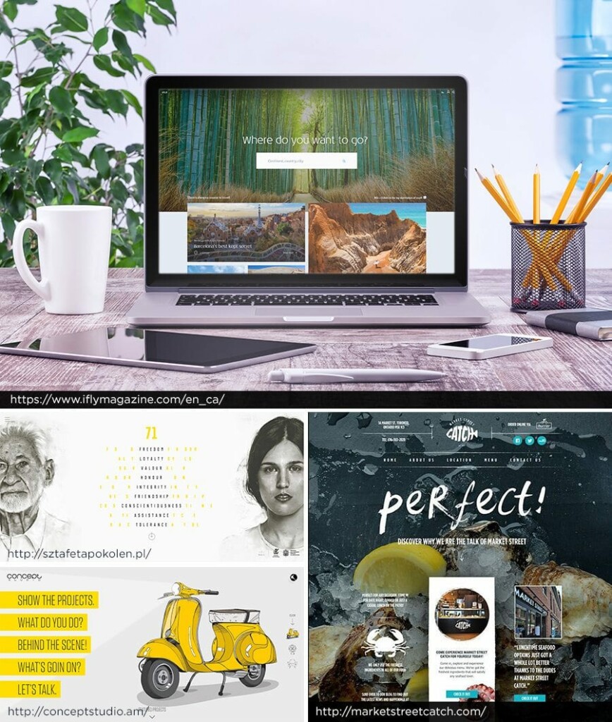
Along similar lines, we think you’ll see more organic design in the form of “doodles” and hand-drawn art. Their crafty feel evokes feelings of home and childhood and overall gives brands a serious case of warm, approachable nostalgia.
Drawing from social media platforms such as Facebook and Instagram, you will begin to see the organic trend find its way into photography. Photos will take on an unfiltered, slice-of-life technology, becoming less posed and more infused with realism, imperfections, and emotional moments.
Mobile-First
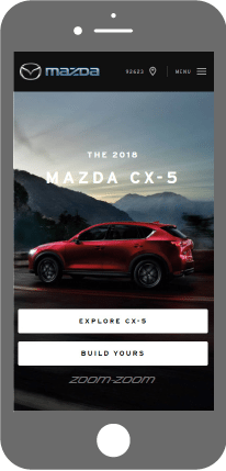
The rapid rise of mobile browsing (and an endless assortment of devices and screen sizes) created critical usability issues for traditional websites, laying the groundwork for responsive design. In 2016, consumers accessed the Internet more frequently on mobile than desktop devices; the world has now transitioned to mobile-first design.
Design trends in previous years highlighted a responsive approach to website design and looking ahead designers should think about smartphones before they think about desktops. Companies are going to think about how their site looks on an iPhone and transition that experience onto the desktop, rather than vice-versa.
Movement
2017 was the 30th anniversary of the GIF. Animated clip art has come a long way, evolving to fit in fabulously with the modern Web in the form of the GIF and leading to movement in graphic design.
This past year and into 2018 there have been many world events and resulting emotions that words alone cannot do justice. GIFs add interest to ads, email newsletters, illustrations, icons, and logos. Animated GIF logos have really become a trend of their own, and it’s easy to see why: They’re extremely enticing.

Complexity
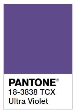
This year Lee Eisenman, executive director of the Pantone Color Institute, told Co.Design, “We’re in a complex time; this is a complex color” when Pantone announced its 2018 color of the year—Ultra Violet Purple.
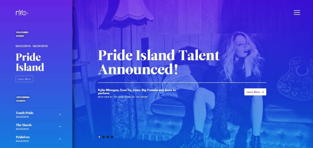
Over the last few years, flat design has dominated design thinking and execution. However, gradients are making a big comeback in 2018, bringing back complexity and depth. The last time gradients were around, they were seen mainly in the form of subtle shading to suggest 3D (Apple’s iOS icons were a great example). Now, gradients are big, loud and full of color.
The most popular recent incarnation is a gradient filter over photos—a great way to make a less-interesting image look intriguing. A simple gradient background can also be the perfect on-trend solution if you don’t have any other images to work with.
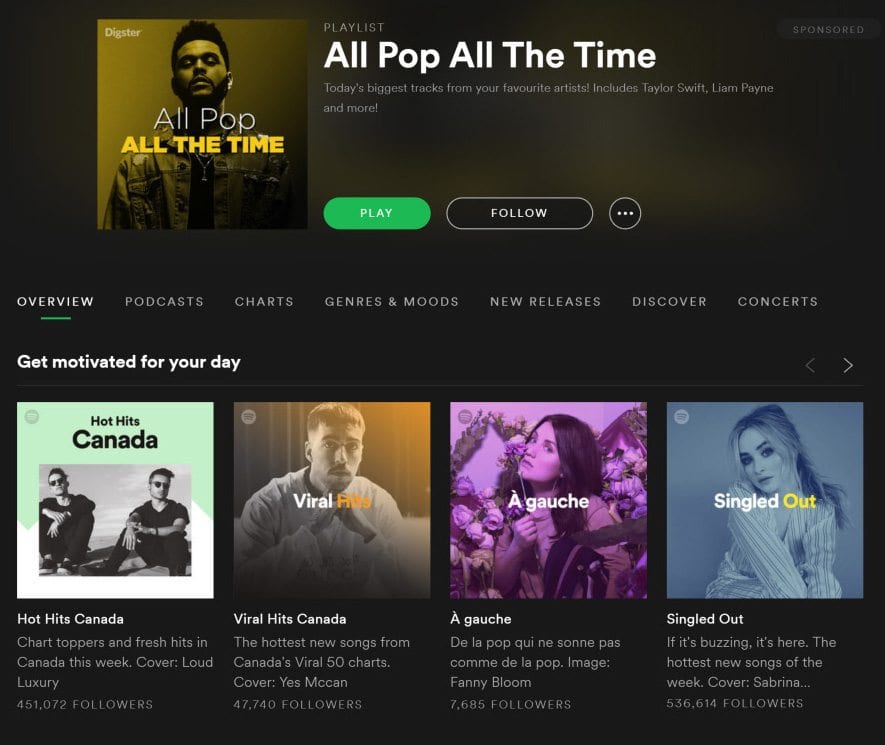
We’re also seeing an increased use of the term “color transitions” when referring to gradients. Though the terms seem to be used interchangeably, “color transition” more often refers to the modern application, which is vibrant, smooth and “flatter”—fitting within flat-design aesthetics. Gradients along with shadows will make a big comeback in 2018.
So, there’s our take on global design trends for 2018. Make sure you call My Brother Darryl for a free consultation and review of your web site or to discuss these new trends and how they can impact your new web design this year.
