Web Design 101: Make sure your site is responsive

In 2016 more than 60% of searches on Google are made on smartphones or tablets, up 10% from 2015. This means your site is likely being viewed and read on such a device. This makes two things very important to your design: responsiveness and being lightweight (read: loads quickly). Being responsive and lightweight equals mobile friendly, and it’s not just something your visitors appreciate, they’re important to Google’s ranking algorithms, so it could affect how many visitors your site gets in the first place.

What is “responsive”?
Your site’s responsiveness refers to designing web pages that adapt themselves in response to the size of the screen they are being viewed on (read about Responsive web design on Wikipedia and Responsive Guidelines and Tutorials on Smashing Magazine). You should not have to zoom in or scroll sideways to read text, interactive with a menu or links, or watch a video on your mobile device.
Test, Test and Test responsiveness again
One of the simplest ways to test for responsiveness on a desktop is to make the browser window more narrow vertically. A responsive site alters its layout as the window changes in size. Another way and the best way is to view the same site on your smartphone, tablet or TV. Resizing the browser window on your desktop is handy, but is not always what someone on a mobile device will see, even if you manage to match the exact resolution. Even viewing the site on one smartphone and tablet is not enough, what looks nice on Safari on an iPhone 7 might not function well or could look like crap in Chrome on a Google Pixel.
Ask your browser
Chrome, Firefox and Safari all have web developer tools built into them. If you right click on a page and choose “Inspect element” (or go to Tools > Developer Tools in the menu) in Chrome for example, you can choose wich resolution or device to preview a site in.
Online tools
Responsinator lets you preview any given URL in different resolutions, simulating a view on different devices: https://www.responsinator.com
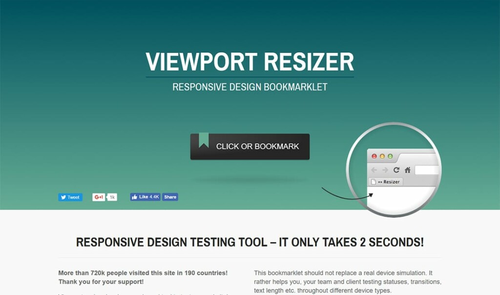
Viewport Resizer is a browser-based tool to test any website’s responsiveness. Just save the bookmarklet, go to the page you want to test, click on your created bookmarklet and check all different screen resolutions of the page: http://lab.maltewassermann.com/viewport-resizer/
Responsiveness is not the future of web design, it is the now of web design.