UI/UX – Button Design Basic Rules

Today we’ll be talking about the basic design principles needed to create effective buttons. Buttons are an essential element of interaction design.
1. Design buttons that look like buttons
Users are busy and easily distracted. When it comes to interacting with your user interface, users need to know instantly what’s “clickable” and what’s not. Every element in your design requires thinking by the user to decode. The longer it takes users to decode the UI (User Interface) the less usable it becomes for them. Degrading their UX (User Experience).
So how do users understand whether a certain element is interactive or not? They draw on their previous experiences and visual identifiers to understand the meaning of the UI object. Visual identifiers hold significant value – they help create affordances in your interface. This is why it’s so important to use appropriate visual identifiers (size, shape, colour, shadow) to make the element look like a button.
It won’t matter how cool you make your designs, if users struggle with what is “clickable” and what is not, they will not take the time to interact. Finding your website hard to use, they’ll be frustrated and move on.
Weak identifiers are more problematic for mobile users. While desktop users can move the cursor over elements to see if the cursor changes its state. Mobile users don’t have this option. They must tap on an element to discover if it is an interactive element … and ain’t nobody got time for that.
Don’t assume that something in your UI is obvious for your users
In many cases, designers intentionally don’t identify buttons as interactive elements because they assume the interactions are obvious for users. Keep this rule close when designing an interface:
Your ability to interpret clickable identifiers aren’t the same as your users’ … because you know what each element in your own design is intended to do.
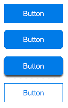
Don’t re-invent the button
Here are a few examples of buttons most users are familiar with:
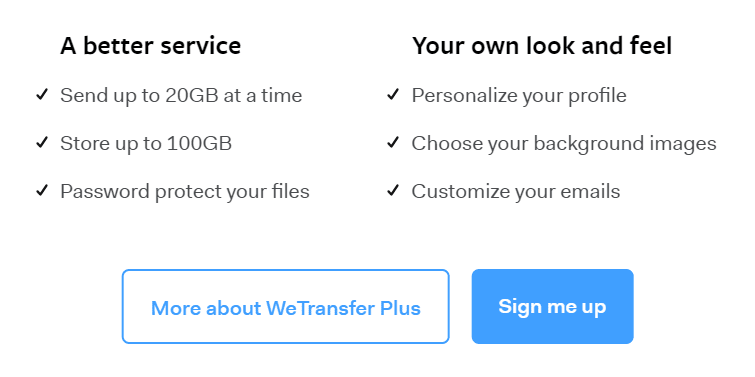
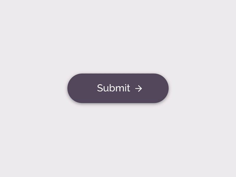
- Filled button with square borders
- Filled button with rounded corners
- Filled button with shadows (clearest for users)
- Ghost button (could be mistaken when not with another button)
2. Label buttons with what they do
A huge source of frustrations for your users are misleading or generic labels on your buttons. Take the time and write button labels that clearly explain what each button does. A button’s label should clearly describe its action.
A user should quickly understand what will happen when they click on a button. Imagine you accidentally triggered a delete action and now you see the following error message.
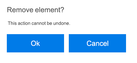
The dialog doesn’t clearly explain what “OK” and “Cancel” represent. Users will need to decide, “What happens when I click on ‘Cancel’?” Does it cancel the remove object action, or does it cancel the object?
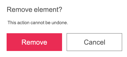
Make it clear what the “OK” labelled button does for the user. This is easily done by changing “OK” to “Remove”. You can also visually warn the user that this action is a potentially dangerous action by using the red colour.
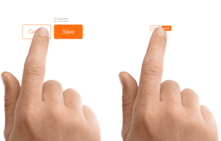
3. Size your buttons properly
Button size should reflect the priority of the element on the screen. A large button means more important action.
Prioritize buttons
Make the most important button look like it’s the most important one. Always try to make the primary action button more prominent. Colour, size, font weight to capture the user’s attention.
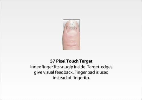
Buttons need to be finger-friendly for mobile users
Many mobile websites have buttons that are two small. This often leads to frustrations with users not being able to see the button or interaction.
A 2003 study from MIT Touch Lab found that the average finger pad is between 10 and 14 mm and fingertips are 8 to 10 mm. This makes 10 mm x 10 mm a good minimum touch target size. The average width of the index finger is 16 to 20 mm for most adults. This converts to 45-57 pixels, which is wider than most mobile guidelines advise.
4. Don’t make users hunt for buttons.
Buttons should be located in places where users expect to see them. If user’s can’t find a button, they won’t know that it exists, users won’t hunt for buttons to interact with.
Tip: Test your design early. When users first navigate to a page that contains some actions that you want them to take, it should be easy to span the appropriate button for the user.
Don’t play the game, find-the-button, with your users!
Conventional placement for buttons improves discoverability. Use traditional layouts and standard UI patterns as much as possible. With a standard layout, users will easily understand the purpose of each element, even when it is a button without strong signifiers. Ample whitespace combined to a standard layout with clean visual design makes the layout more understandable.
5. Mind the order
Ask yourself, what order users expect to have on their screen and design accordingly. For example, how do you order “Previous/Next” buttons in pagination? It’s logical that a button that moves you to the next post should be on the right, and a button that moves you to the previous post should be on the left. The order for buttons should reflect the conversation between the user and the system.
6. Provide appropriate feedback on interaction
When users click or tap on the button, they expect that the user interface will respond with appropriate feedback. After all, this is what happens with a real button. Based on the button’s operation, this might be visual or audio feedback. Without feedback, users may consider that your website didn’t receive their command and will repeat the action. This behavior often leads to multiple unnecessary operations, or wrong responses being sent from the website.
Why do we repeat our action? As humans, we expect and respond to feedback after we interact with an object. Whether it’s visual, audio or tactile feedback, anything that acknowledges the fact that interaction was registered.
Some operations require additional feedback to your user such as uploading. This shows the user that your website is doing something and the amount of time remaining for the action to complete.
7. Too many buttons, too many choices
When you provide too many options, your users end up doing nothing. Think about a restaurant menu. Too many choices make it very hard to decide what you want to order. When designing pages in your website, draw attention to the most important actions you want your users to take.
Conclusion
Buttons are an ordinary element of interaction design, putting the required attention will make this element as good as possible. Button UX design should always be about providing clarity of an interaction to your user.