Top 10 Web Design Trends 2018
Web Design Trends are a lot like leaves.
They bloom all year long, change colours & textures, then… they fall – making room for new growth and new opportunities! Y’know, unless they’re evergreen…
We’ve put together the ultimate list of The Top 10 Web Design Trends for 2018. While some of these design trends may not make it to 2019, there is still time to incorporate them into your design strategy, and enjoy what’s left of them before they hit the ground!
Let’s dive in…
1. Chatbots
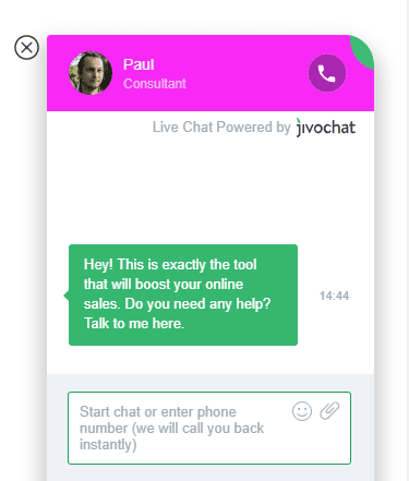
You’ve probably seen them in your own day-to-day web surfing, and more & more business websites and social media profiles are utilizing this communication starter.
So, what is a chatbot? A chatbot is a messaging window that pops up on the screen when you land on a business’ website or social media page. A direct opportunity to open a line of communication between your brand and the customer. Adding a chat window like this to your website or social media page, means that any visitor with a question can have it answered immediately (or within a specific time period).
The one challenge that comes with the addition of a chatbot, is having someone available to answer said questions in real time. But, fear not! You can actually program a chatbot to answer some of the “most common questions” your customers have, so that most visitors can still get their answer right away. If the chatbot doesn’t have an answer for a specific program, you can program it to provide details on how best to get in touch with a live representative so your visitor still knows what to do next.
(Isn’t technology fun?) Chatbots are snappy, always available, and you can use them in lots of creative ways. They’ve also been proven to not only improve user engagement, but, attention spans too!
Chatbots don’t necessarily make sense for every style of website, but if you have a business website (especially ecommerce!) and you get a lot of frequently asked questions, they can save your staff time while still providing your visitors a good user experience.
2. Interactive User Interfaces
Animated user interfaces are a hot topic of debate these days. While some find animation an unnecessary feature, most users have come to expect motion as an integral part of the “interaction experience”.
But, why do we love motion so much? When done properly, animation can possess life-like qualities creating a level of perception close to what people have when they are interacting with a physical object – or person – in real life. The key is to keep it simple and straightforward.
The more natural the interaction feels, the more positive, and satisfying the user experience will be. It’s no secret, satisfaction and pleasure are among the reasons people will use your product over and over again.
This animated Yeti login screen created by Darin Senneff is a great example.
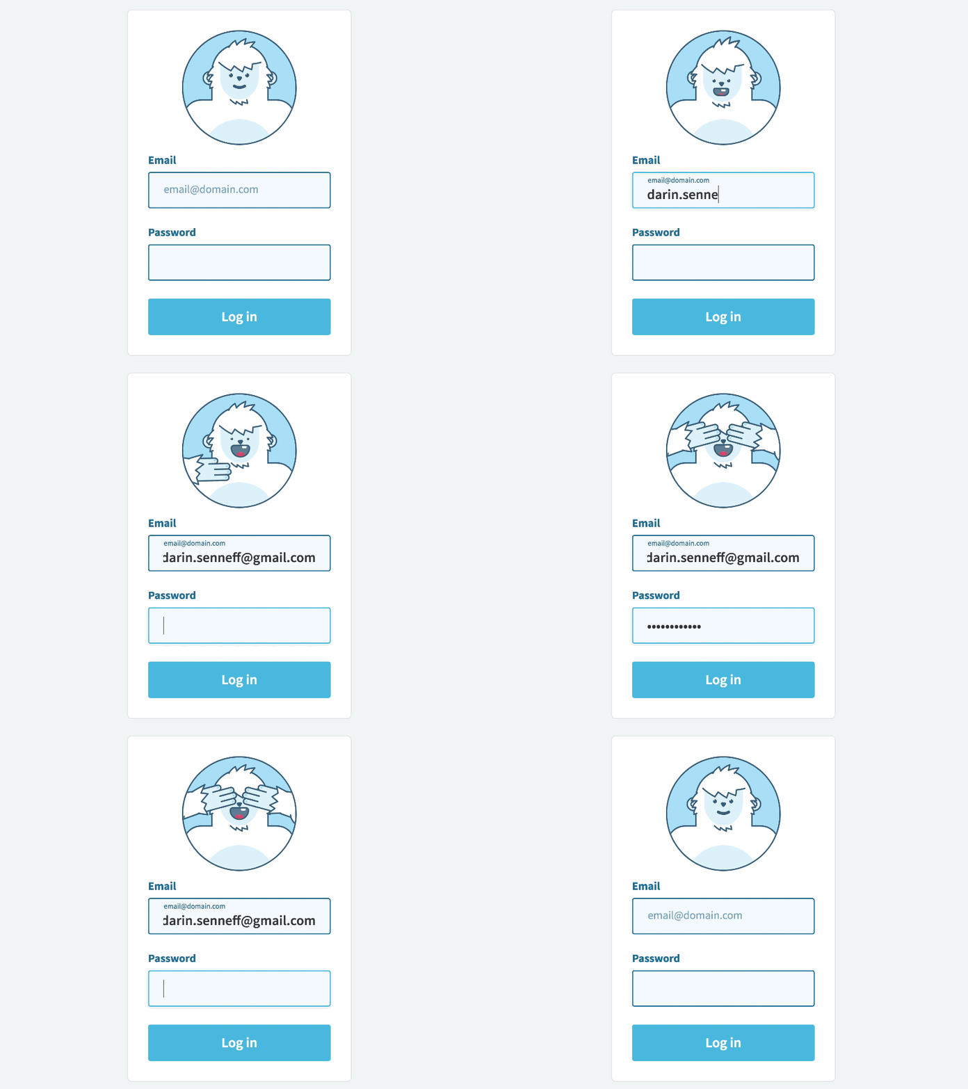
Simple, interactive, and playful – this Yeti reacts to the user’s input, being careful to block it’s eyes when you enter your password. No piracy here.
3. Asymmetry and broken grid layouts
Gone are the days of symmetry – and we are loving every minute of it!
While this web design trend may have started in 2017, it has officially become the “norm” for websites everywhere.
Grid systems are the foundation for providing a rhythmic structure in any layout – but, when you overlap text here, and disjoint colour blocks over there, something beautiful happens.
The appeal of an asymmetrical layout is that it is unique, distinctive and sometimes experimental. Breaking the grid (so to speak) is becoming more and more popular as a way of emphasizing UI elements, and directing the audience’s attention to the call to action.
But – how much is too much? This will change from website to website depending on the layout composition. Composing designs based on two juxtaposed overlapping grids, is the most common practice among designers. Go bold – but remember, less is more.
4. Polygonal Shapes and Geometric Layers
No this isn’t your grade school geometry class.
Polygonal shapes have been trending in clothes, jewelry, & decor since early last year – finally, they’ve made their way to the world wide web. (…and we aren’t complaining!)
One of the most distinct web designs of 2018, this trend focuses on geometric themes, specifically polygons and layered shapes. You can probably recognize this style when you see it, but to break it down, a polygon is any closed-off shape with straight lines – typically 3-5 sides. Let’s take a look at the components that make up this straight-edged web design trend:
Simple geometry
This trend includes every floating triangle and square you see, but also original shapes (both regular and irregular) or basic geometric patterns (grids, planes).
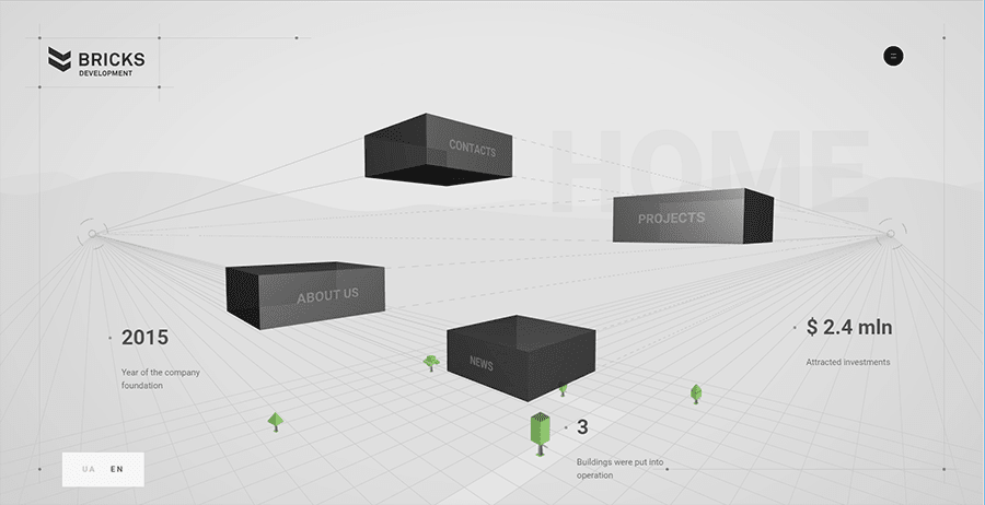
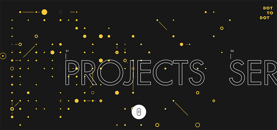
Bold Lines
Lines are geometry too, so highlighting them fits this style as well. When used correctly, big, bold lines can visually carry a screen, or draw attention to the complementary image.
When using thick lines, you want to pay attention to both color and intersection points. Color will determine where the user’s attention goes, whether drawing attention to or away from the lines. Intersection points inherently become focal points, so use them to your advantage.
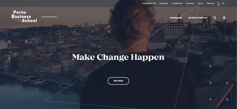
Details
Fear of commitment? That’s okay – you don’t have to utilize a full geometric aesthetic. You can use this web design trend for accent details. Polygons and geometric layers are visually interesting at any size, and so they make great secondary graphics or even button icons.
5. Tactile Design
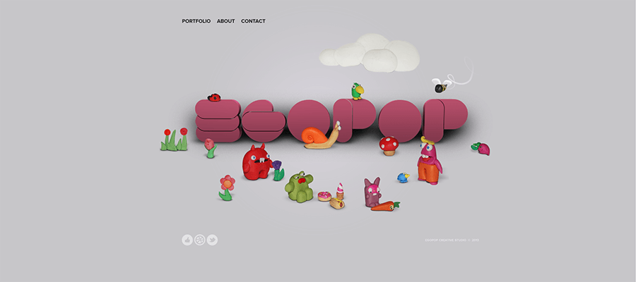
In a world of 4D TVs, and 3D movie theatres, Tactile Design has been a long time coming. It grew from the principles of Material Design, but at the same time it modernized the old skeuomorphism trends from the early 2010s.
Tactile Design makes objects appear real in a digital space, as explained in Google’s Material Design Guidelines, “the material is grounded in tactile reality, inspired by the study of paper and ink, yet technologically advanced and open to imagination and magic.”
Here are some of the fundamental components, for a great tactile design…
No Borders
Tactile is a great concept, for a website that utilizes negative space (white space). There are no borders or windows leaving room for certain elements – particularly text – to cross over from one element or screen to the next.
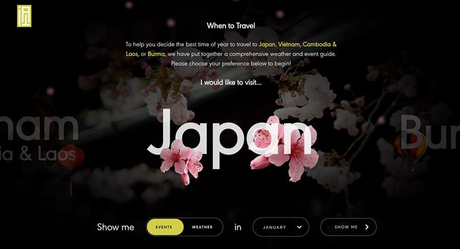
Multilayer Design
Like Material Design, Tactile Design incorporates multiple layers to create a “life-like” look. Drop shadows will become your best friend, for distinguishing layers and instilling realistic qualities.
Detailed Photography
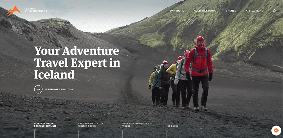
Realism is key for a successful Tactile Design, which is why detailed photography is crucial. Having a mixture of HD quality and close up angles is extremely beneficial, especially for ecommerce sites, since detailed photos give customers a life-like sample of what they’re buying.
6. Retro Design
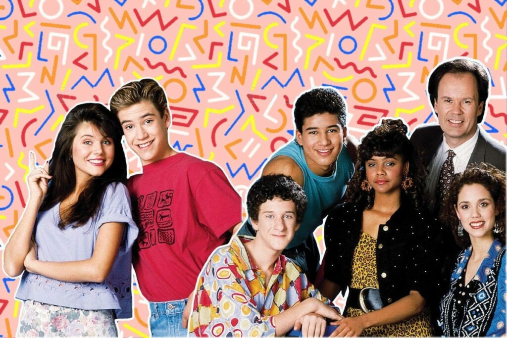
All aspects of life nowadays are in an age of nostalgia. This is especially true for Web Design. More and more designers are borrowing from the recognizable styles of the 70s, 80s, and 90s – each with their own fascinating qualities. Let’s take a look…
The 90s:
A time of exploration for digital platforms, with lots of colour, animation and moving parts
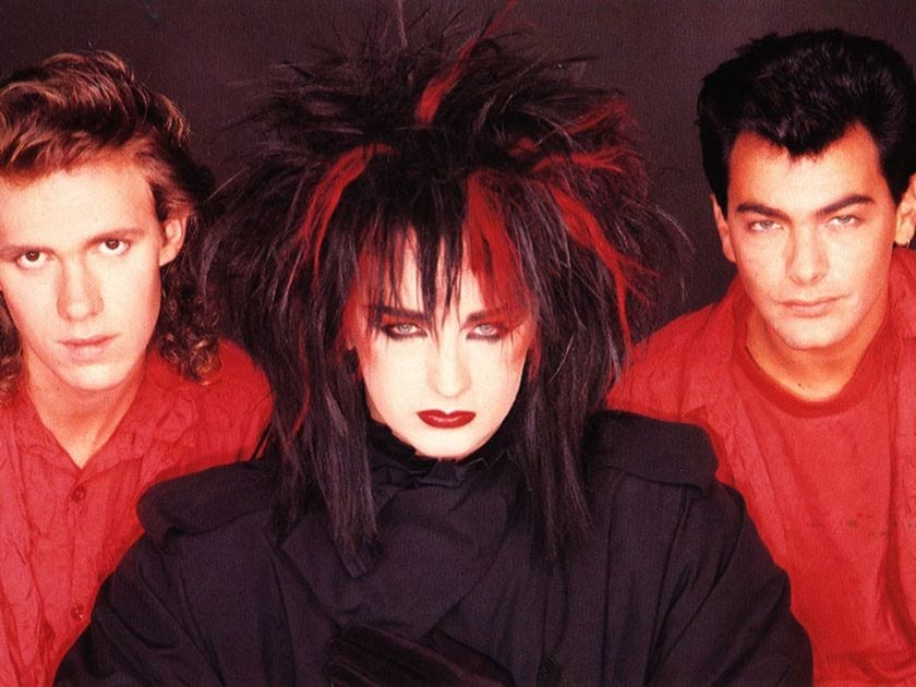
The 80s:
A pixel party, with inspiration from the budding video game industry, mixed with bright neon fashion & cultural inspiration, and who could forget early MTV.
The 70s:
Bold typography with psychedelic fonts and muted colours (like your favorite filters!)
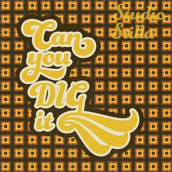
While some design styles are better left in the past, there are some that are worth keeping.
Here are a few we love:
Old-School Typography
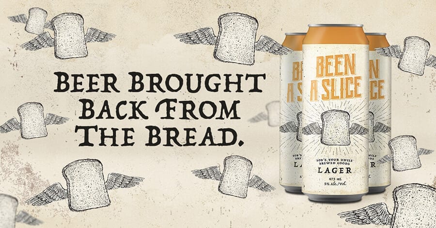
Fonts with elaborate strokes, thick cursive, and/or rough edges are becoming popular again, as are fonts reminiscent of old movie posters.
The key to using such “loud” fonts effectively is moderation. Big and bold typography is ideal for titles and headlines, but can be distracting for secondary information or body text. It’s best to pair loud fonts with a simpler and subtler font for normal copy.
Colour Blocks
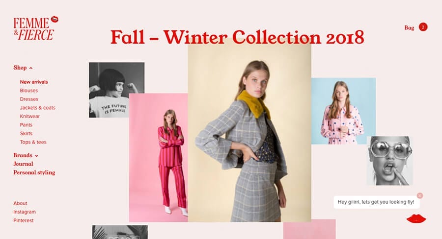
Again, moderation is key. Whether using muted colors or bright colors, modern web design pays extra attention to color. Color overlays are common, and so is using matching colors to accent other images and illustrations.
Texture and Gradients
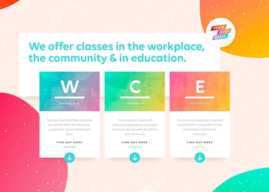
Colour gradients is a trend we are seeing more and more of. But again, too much CAN be overkill. Some organizations put plenty of texture to give their sites a more realistic feel, while others are stripping away such effects for a stark minimalism.
Video-game Style
Old school Nintendo games are back in a big way – and so is the “pixel” web design trend. A popular style, even for non-gaming sites, with an interesting aesthetic both older and younger generations love. If you’re looking for a real stand out design, this trend is for you! The question is… do you prefer Mario, or Donkey Kong?
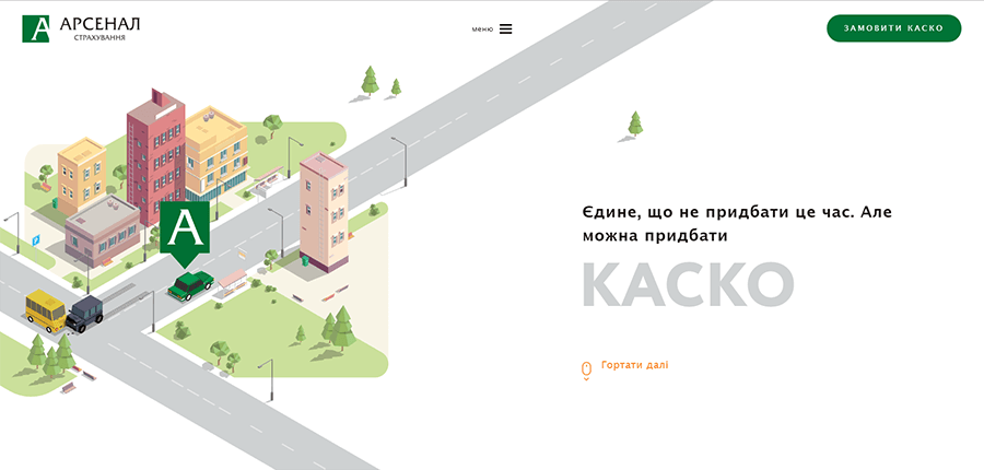
7. Simple Homepages
Flashy, over the top homepages can be a real turn off. They can also slow down your operating system too, making for a poor user experience. That’s why this year, we are seeing more and more companies “returning to basics”.
Simpler home pages that act as more of a gateway, than just a source of information.
This trend requires a combination of complementary trends – to create a modern, minimalist homepage that will still attract visitors, you can utilize any number of the trends below.
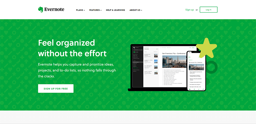
Minimalism
A simple, easy-to-use, go-to style. Easily identified by its abundant negative space (white space), big & bold typography, and colorful accents. For homepages, color works best to draw attention to your main call-to-action, as with Evernote below.
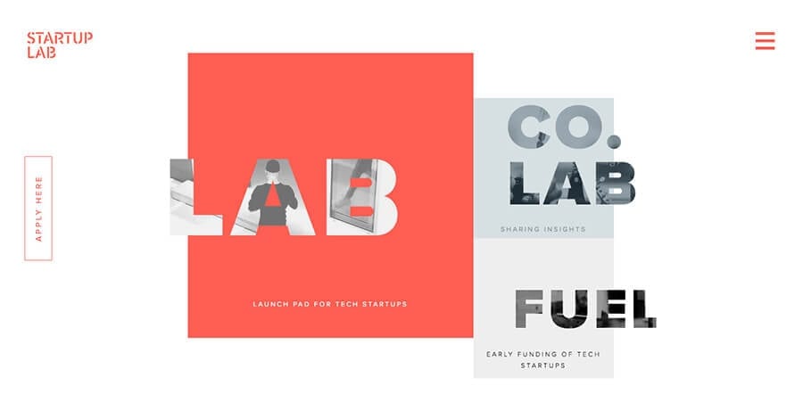
Flat Design
There’s flat, almost flat, and flat 2.0 Flat – similar but with distinct differences. Like minimalism, a flat design can help to reduce distractions and take advantage of colourful accents.
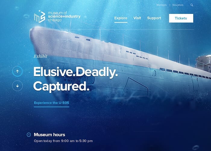
Subtle Animations
As we learned above from Interactive UI’s, animations can improve both usability and user enjoyment… but they can also distract the visitor from your main CTAs.
To make the most of this element, try using automated animations that move on a fixed schedule, or, trigger-based animations that move when the user clicks or scrolls. These subtle animations will give you the benefit of movement, without losing the simplicity of a modern homepage.
8. New Age Navigations
Static, horizontal navigations at across the top of your website is so 2017. Designers looking to add extra “oomph” to their websites are now experimenting with different options, including both the hamburger option, and floating navigations.
Hamburger Navigation
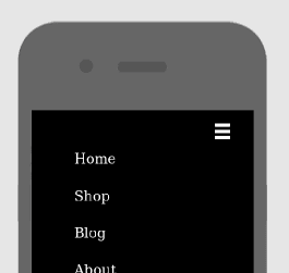
The Hamburger Navigation option, is an icon of 3 horizontal bars usually located in the top left or right hand corners. Like with every menu design, there are pros and cons – pros being that it’s clean & recognizable, cons being that it doesn’t showcase features very well.
But, you can’t argue with having direct access to the content you came for. Which brings us to option two..
Floating Navigation
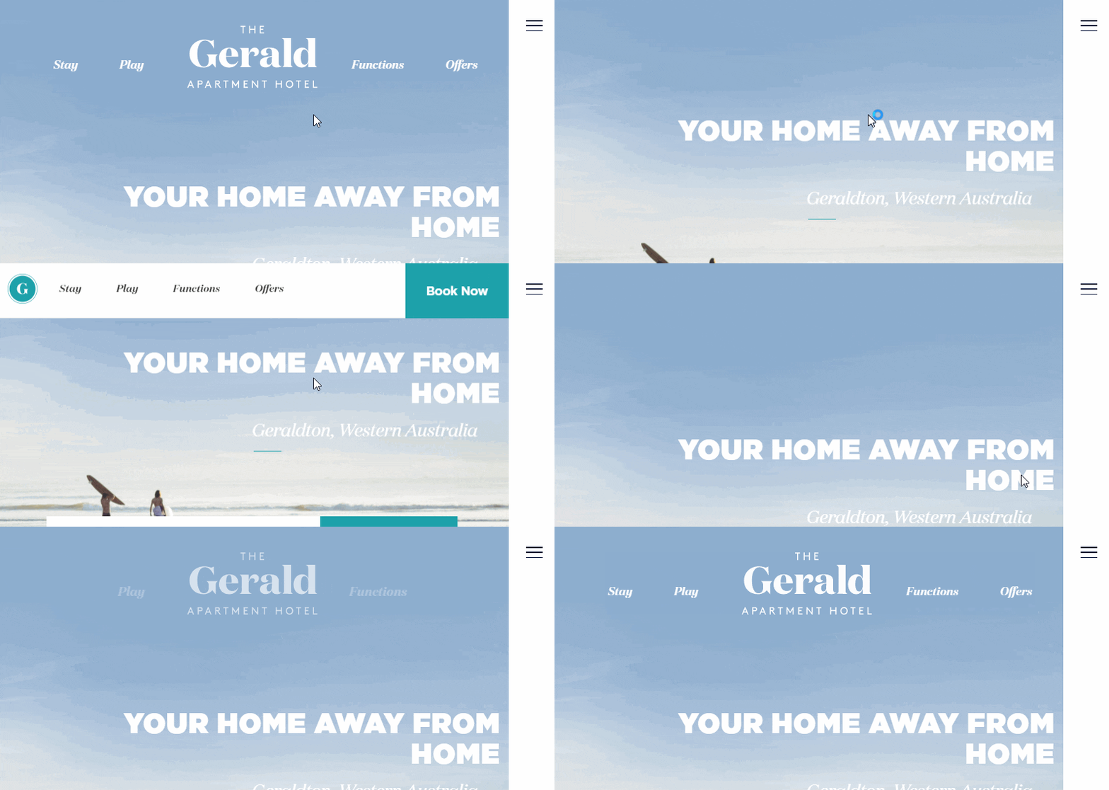
Floating navigation stays visible even as you scroll down a page. It provides a unique experience, but also offers the practical benefit of keeping all the navigation options in the forefront, present and visible no matter where your visitor is on the page.
It’s not a particularly common web design trend as of yet, but, it’s ease of navigations for users makes us think it will continue to gain in popularity!
9. Minimal stock photography
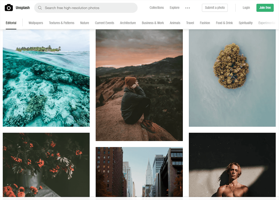
Even the best stock photography has cheesy undertones, which is why more and more companies are choosing to avoid it. But, when you need it for a specific project or page – we highly recommend Unsplash. This website is a great resource for “real-life” stock images, that are generally great quality images… for FREE!
Be sure to adapt and combine the stock photos and the content so that the message you are trying to communicate resonates with your audience. Try using unique stock images with solid background colours that emphasize the product, or some it’s key features.
10. Responsive Design
Last, but certainly not least.
While responsive design isn’t technically a “new for 2018” web design trend, it is certainly one that has gained a lot of ground this year. Mobile usage is only going up, and businesses are finally catching on to the “mobile-friendly” design trend.
If your website provides a disappointing user experience on mobile, odds are that the visitor will not stick around, and on top of everything else – it’s BAD for SEO.
You could spend the extra money and create two versions of your website – one optimized for desktop and one for mobile devices – but the better option more often than not is to simply make one that is responsive.
On a responsive website, each page has all the same copy, images, and elements no matter what device you view it on, but they’re arranged differently based on the size of the screen. For example, an image that shows up next to the text on your desktop may show up below it on a smaller screen.

Utilizing a responsive website ensures that your mobile users get all the same information and value from your website, while having a user friendly experience.
When building your responsive website, take these tips into consideration:
- Replace header videos with stills from the video. If you need to include a video on your mobile site, use a link to YouTube.
- Instead of hover effects, use tappable buttons or gesture controls can hide/show information.
- Keep animations simple. They just don’t work as well on mobile.
- Replace dropdown menus with hamburger menus. Love them or hate them, hamburger menus are an established pattern that everyone already knows how to use.
- Reevaluate colors and backgrounds. Mobile devices sometimes require more contrast to maintain readability.
Intimidated at the thought of building one of these website? If a designer is not in the budget, consider a website builder that offers responsive templates.
In conclusion…
2018 has been quite the year for Web Design Trends. Day-after-day we are seeing changes, transitions and huge advancements coming into play. Will they last? Or will they be raked up with the changing of the seasons?
No one knows for sure – but we sure can’t wait to see how these Web Design Trends play out.