Making Delightful Web Interactions

We’ve focused on making our websites bespoke, our content accessible and robust, and now let’s focus on creating a better user experience. Otherwise known as UX, the term ‘user experience’ describes the way we help and encourage users to interact and experience the website.
We are constantly trying to find ways to decrease our website bounce rate, and convert visitors to customers. We can’t retain users as long as we’d like, if the experience is bland and boring. One significant way to encourage users to spend more time on site and increased interactions, is through microinteractions.
What the heck is a Microinteraction?
The term microinteraction refers to events, triggered by the user, that only have one main purpose. To engage the user. Think of it as the icing on the cake – while the cake is fantastic on it’s own, the icing makes it a much more delightful experience!
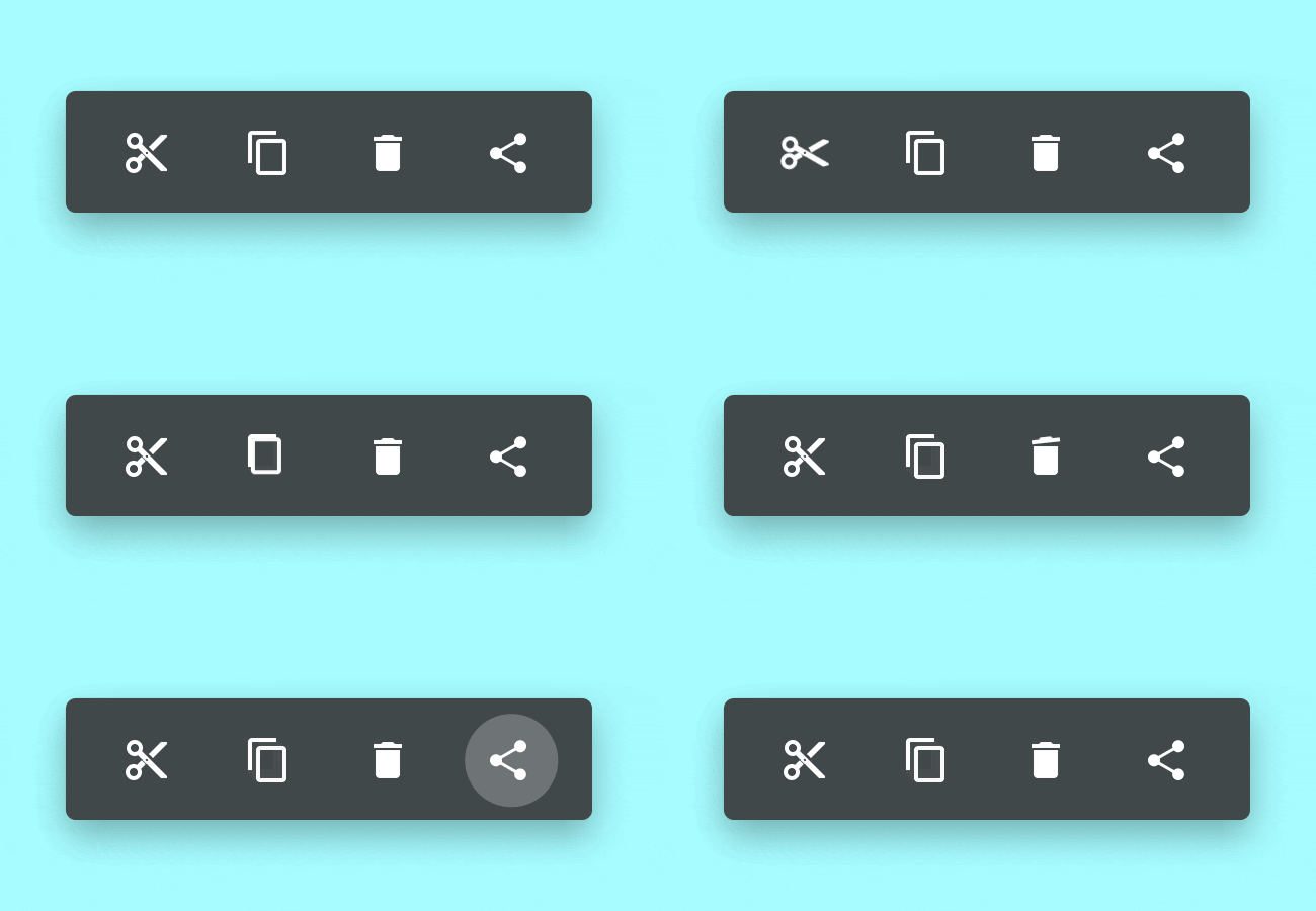
The example above, shows a micro animation attached to the button click, giving the user instant feedback that the button was successfully clicked. But a microinteraction doesn’t have to be a button, or even an animation. Essentially they are a single task interaction event – such as an error message, a popup message, a button state, or animation. The event must fulfill three important functions:
- They communicate a status and provide feedback.
- They give the user a sense that something has been physically manipulated.
- They help users see the result of their interaction.
As well, there are some rules to microinteractions:
- They are intuitive and as such do not require explanation or instructions.
- They are seamless. They should never be distracting to the flow of the site.
- They must integrate to work in a variety of environments so that all possible user cases are considered.
- They should not be applied to non-interactive elements – such as decorative elements. This avoids confusion with the user thinking a static element should be doing something.
If it’s such a small detail, why bother?
“A bad user experience can make all the difference, so next time you’re designing a website or an app, remember to stand in the users’ shoes for a second. Empathy is a human emotion; this means that it’s the key to designing user interfaces that are both helpful and humanlike. Interfaces that are designed to function in a natural way are better understood by users.”
– Daniel Schwarz, UX Tricks
Here are some examples of best practices. These are elements that when designed right, are particularly good at increasing interaction:
Progress elements: Loading buttons and screens. A wheel turning does not provide as much information as a progress bar. If a process is expected to take a period longer than 3 seconds, such as a file upload, you should use a progress bar. A user can quickly get frustrated and leave when they can’t see progress.
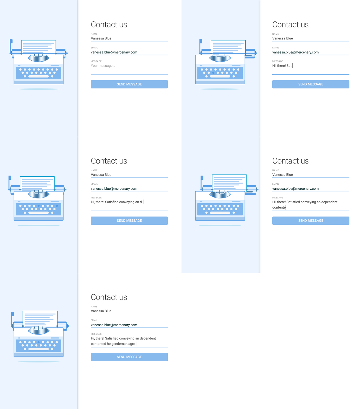
Data Validation: Clear use of form error field states and helpful feedback messages create positive interactions.
Calls to Action: Buy now, Chat, Contact, Share, etc. Making these buttons look interesting and even fun essentially nudges the user to interact with them.

Simple Action: Upvote, like, follow, share buttons, on/off switches. Animated buttons can help by giving feedback and help to answer simple questions like: is it on or off? How much longer do I have to wait? Is it currently doing anything?

The focus of all of these interactions is on encouraging the interaction and giving instant feedback and gratification to the user.
Seriously now, how many times did you click the button above?? Think about what made you click it multiple times.
You can see how these small interaction events might help give your website a more interesting and engaging experience. If you’d like to know more about microinteractions and how we can help develop custom microinteractions for you, contact us today.