Looking at the Web Through Disabled Eyes

When the web was new and businesses were jumping on-board, the web was a free-for-all. There really were no hard and fast rules. Very few people thought about disability or whether their website would be accessible for anyone with even a mild visual impairment.
If it looked good and the content was relevant, it would attract customers. Now we recognize that many of these sites were completely inaccessible to the millions of people who have disabilities. WCAG 2.0 Level A is now law for all business’ that have more than 50+ employees. If you aren’t a 50+ employee company, web accessibility is still an important feature to implement.
WCAG 2.0 Level A is almost entirely about information. Ensuring there’s alternative ways of accessing and understanding items like images, videos or interactive/rich media. Did you know that having a properly built accessible site actually HELPS your search ranking?
I’m going to give you a run down of some of the most basic WCAG 2.0 Level A accessibility standards and why you must integrate them into your website as soon as possible. This is by no means a comprehensive list and if you have any questions or would like an in-depth accessibility review of your website please contact us.
Alt Text
What is it?
Otherwise known as alternative text. It is code added to each image that explains to the user what the image is.
Why is it important?
This is one of the most overlooked accessibility feature that plays two very important roles on your website.
- The first role is if the image does not display, (the image is missing or the user does not have images turned on) or if the user is visually impared, the alternative text is displayed onscreen and/or read out to the user to explain what the image is.
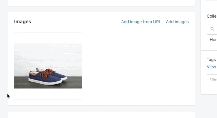
- The second use for alternative text is for search results. A properly crafted alt tag will help reinforce the content on your page and increase the searchability of your page content within search engines. For example, if the image is of Blue running shoes, your alt tag may say “Blue Running shoes with white soles”, which will then be picked up and logged by search engines which will then serve it up to anyone looking for blue running shoes. If the alt tag just said “running shoes” it will still be served up, but since it’s less specific, it may not reach your intended audience.
Exceptions to the rule
There are some exceptions to the rule. If the image has no real meaning to the user – for example, a decorative swirl image – you still MUST have an alt tag, but it can be left blank with no description.
Language Attribute
What is it?
It’s code included at the top of your webpage that specifies the natural language of the content.
Why is it important?
Identifying the language allows do a number of things.
- Change the styling of your site by language, for example changing the color, font, or spacing to allow for better lingual readability.
- Allows search engines to detect the language and serve up language specific resources.
- Allows the use of translation tools.
- Assists non-text readers, assists speech synthesizers and Braille translators to produce usable results – (for example, allowing the reader to properly prononunce the words according to the language chosen).
Even if your site is English only and you don’t intend to serve other languages, it’s still a good idea to add this code. You never know if one of your customers may wish to have Google translate your site for easier reading in their native tongue.
Accessible Links
What is it?
In order for a link to be readable by a screen reader, the link must contain either plain text or in the case of a linked image, alt text describing the action of the link.
For example, a link that says “click here” or “www.somewhereland.com/1258QR”, is not accessible as it does very little to help the user understand where the link will take them or what clicking the link will do.
A link that says “Get Help” or “Visit our sister site Somewhere Land” gives more robust information about what this link will do.
Links should also be easily recognized as links, by using more than just color differentiation. For example the standard underline of a text link is easily recognized as a link whether the person is color blind or not. This also includes linked images, which should have a visible hover and active state that clearly identifies the item as interactive.
Why is it important?
Not only do accessible links add to the ability for all users to easily navigate your site, a well crafted link can also increase your search ranking.
For example “Click Here” has no content that would help rank your site, whereas “Find out more about how Product A can increase your metrics” has a nice longtail keyword.
Easy to recognize links are important even for fully sighted users, enabling them to navigate your site more easily, leading to increased engagement.
Headings Must Not be Empty
What is it?
More than a few content creators use empty heading tags as spacers instead of using proper coding. Headings must contain content and must not be hidden.
Why is it important?
Screen readers alert users to the presence of a heading tag. If the heading is empty or cannot be accessed, it may confuse users or even prevent the screen reader from reading sections of content within that page.
From a search engine optimization (SEO) standpoint, an empty heading tag is a missed opportunity and could cause unexpected search results in the listing. Headings inform search engines about the important topic keywords of your page.
Hidden content also acts as a negative in terms of search engine ranking and Google will most definitely penalize your website for violating this rule.
Sufficient Color Contrast
What is it?
Imagine for a minute you are having trouble seeing. Your eyes are a little blurry or you have trouble seeing color contrast — to the point where like colors bleed into each other. For millions of people this is a reality.
Why is it important?
Whether your target is business to consumer (B2C) or business to business (B2B), 8+ percent of visitors will suffer from some type of color blindness.
There are many accessibility tools that can help you assess and identify whether your color contrast passes or fails the different accessibility rules.
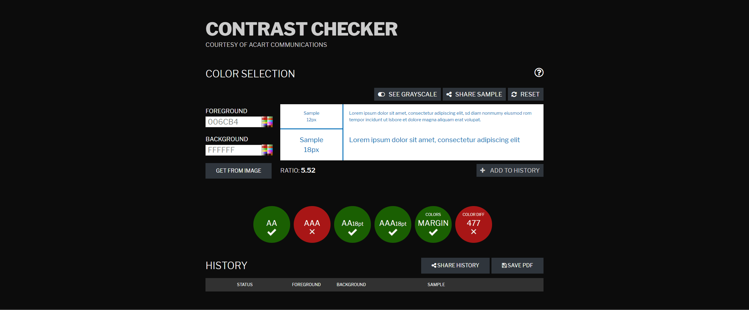
Contrast Checker will help you check accessibility throughout the design process by letting you know if the colors you are designing with meet the contrast rules. You can either input your colors manually or upload an image from the “Get from image” button to test your color combinations for accessibility.
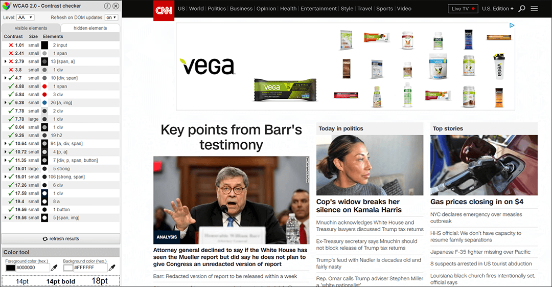
For already created pages you can use tools like the WCAG Contrast checker add-on for Chrome Browser. This gives you a sidebar that shows you all the items that pass and fail accessibility on the page.
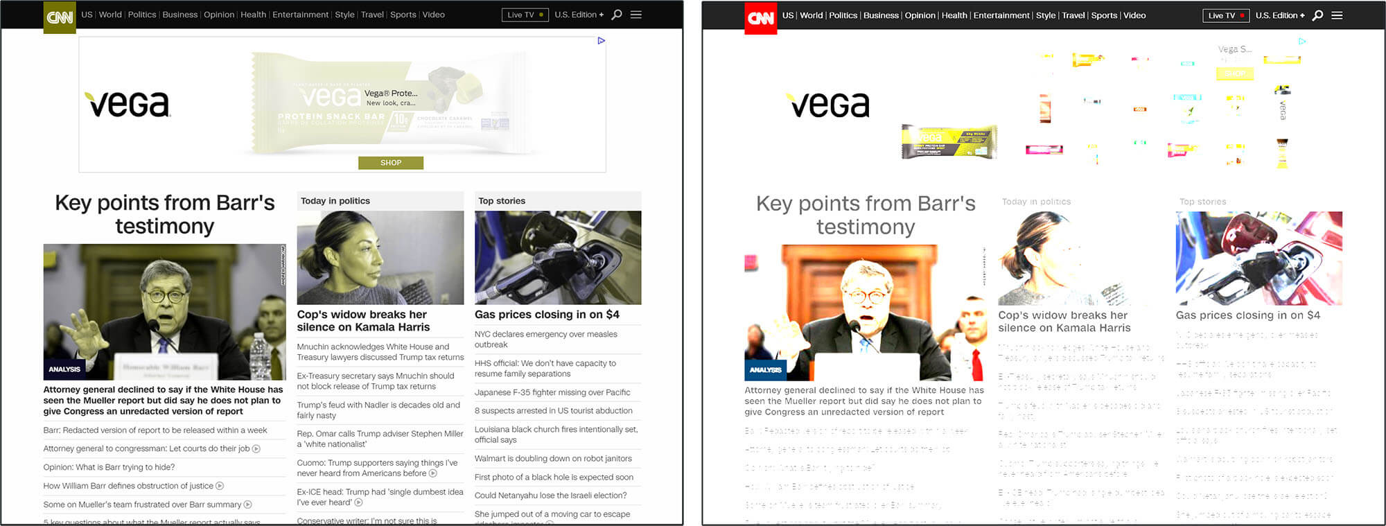
The Chrome Web Disability Simulator add-on is also a great tool that allows you to view your site through the eyes of someone with a disability.
With options like different visual difficulty emulators to mobility, reading and writing and concentration difficulty emulators, you can get a better idea of how a disabled person may view your site.
Mobile Friendly
What is it?
The practice of creating a website that can be viewed on an unlimited number of screen sizes and orientations. As well, the site should allow for font and structural changes that allow the visitor to easily read and navigate the site without the need to zoom in or out.
Why is this important?
This should be something you’ve already implemented on your site, since it’s been 11 years since the first iPhone! You may not think of this as an accessibility issue, but it most definitely is. Many assistive devices are different sizes dependent on the needs and abilities of the user. For example a wheelchair-user may have an iPad within reach at all times. With this in mind, is the mobile version of your site easily read or is the font too small?
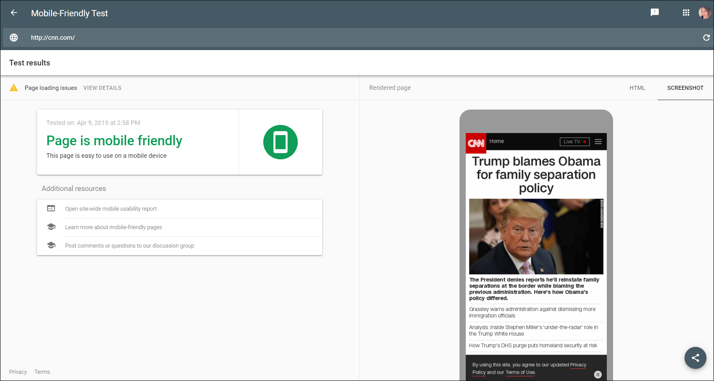
To check your mobile friendliness you can try the Google Mobile-Friendly Test Website.
There are many other tools to help identify accessibility issues within your website structure. This is just the tip of the iceberg when it comes to the WCAG 2.0 Level A standards and tools. If you are a company that is serious about getting your site in line with the standards, you should think about hiring a professional company with the experience to ensure that your site is built properly with future standards in mind.
Want to know more? Read the next post in my Accessibility series “Is Accessible Design Ugly?“
If you have any questions or would like to hire us to help you develop a fully accessible website, contact us today! 1 (905) 852-2615