Is Accessible Design Ugly?

Make it pretty… or make it accessible. It’s a conundrum. Should your website be beautifully designed showcasing your product… or should it be high contrast, stark, and highly accessible to those with disabilities. “Accessible means ugly” seems to be a mindset that many stakeholders have – and I’m going to be honest – finding beautifully designed sites that are compliant is actually a challenge!
Can a web design be both accessible and beautiful? The answer is an emphatic: YES! OF COURSE! The WCAG 2.1 accessibility rules were not made to muddy up your website into a boring palate of black and white – they are made to allow everyone experience your brand! Will you have to make some concessions? Yes, most likely. Will this damage your branding? That’s highly unlikely! With some creativity you can take these boring rules and create an amazing experience for all users!
What are the barriers to accessible web development that business owners are facing?
The 3 major issues are as follows:
- A web designer is either not being used for development, or the designer is not properly informed on the latest WCAG 2.1 rules and/or the site is not being tested thoroughly for accessible UX.
- The stakeholder declines to follow the WCAG 2.1 rules because it doesn’t follow their creative vision for the website.
- The web designer/developer/stakeholder does not understand the implications of not following at a minimum the WCAG 2.1 Level A specifications.
In Norway, a high level of web accessibility is a legal obligation for both public and private businesses. As of July 2013 all new & redesigned communication technology must be WCAG 2.1 Level AA accessible and existing websites must meet the specifications by 2021. All of this stems from a prohibition against discrimination on the basis of disability, which is also known as the Anti-discrimination Accessibility Act.
“In Norway, we want a society where everyone can participate. Therefore, universal design of ICT (information and communication technology) is a legal requirement for both public and private sector.”
https://uu.difi.no/om-oss/english
This law is actually enforced by the state agency DIFI and real consequences are being doled out for companies that don’t comply. The non-compliance reports are publicly published with both bad press and government fines ensuing.
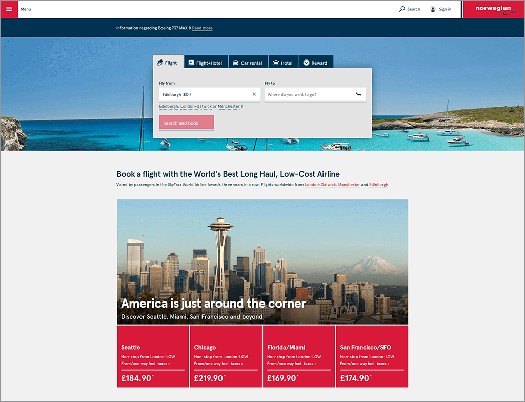
Countries like Norway are leading the way to bridge the gap between able and disabled. In Ontario, Canada, there are provincial laws forcing 50+ employee companies to be WCAG 2.0 Level A compliant. The Canadian government is moving towards passing a bill (Bill C-81), which will include web accessibility standards, regulations, compliance and enforcement for communication technology. In the US, apart from government, there are no enforceable ADA legal standards to follow for website accessibility – but Title III of the Americans with Disabilities Act (ADA) prohibits discrimination on the basis of disability. Since there isn’t a legal requirement for non-compliant companies to redevelop, we’re seeing a rise in web development accessibility-based lawsuits. In 2017 alone the US saw 814 web accessibility-based lawsuits filed in federal and state courts. For example, Glossier is currently being sued for not maintaining an accessible website, after a user faced multiple barriers while trying to navigate their e-commerce site.
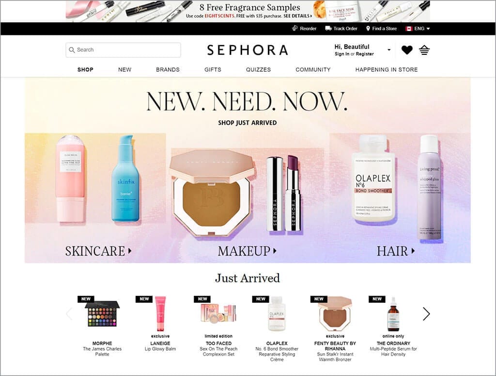
The clothing and cosmetics industries are notorious for being non-compliant. Instead favoring aesthetics first. Fortunately there are companies like Sephora who are keeping their site very close to being 100% compliant, and are still able to look fantastic.
Making your site accessible has even higher importance when you understand that studies show that websites that follow at least the WCAG 2.1 Level A compliance gain better search results, higher usability and reach a larger audience. This makes sense when you understand that following these rules adds more useful information to your site, that then allows Search engines to gain a greater understanding of your site. Your site might look absolutely fantastic… but if it’s not found, it’s a waste.
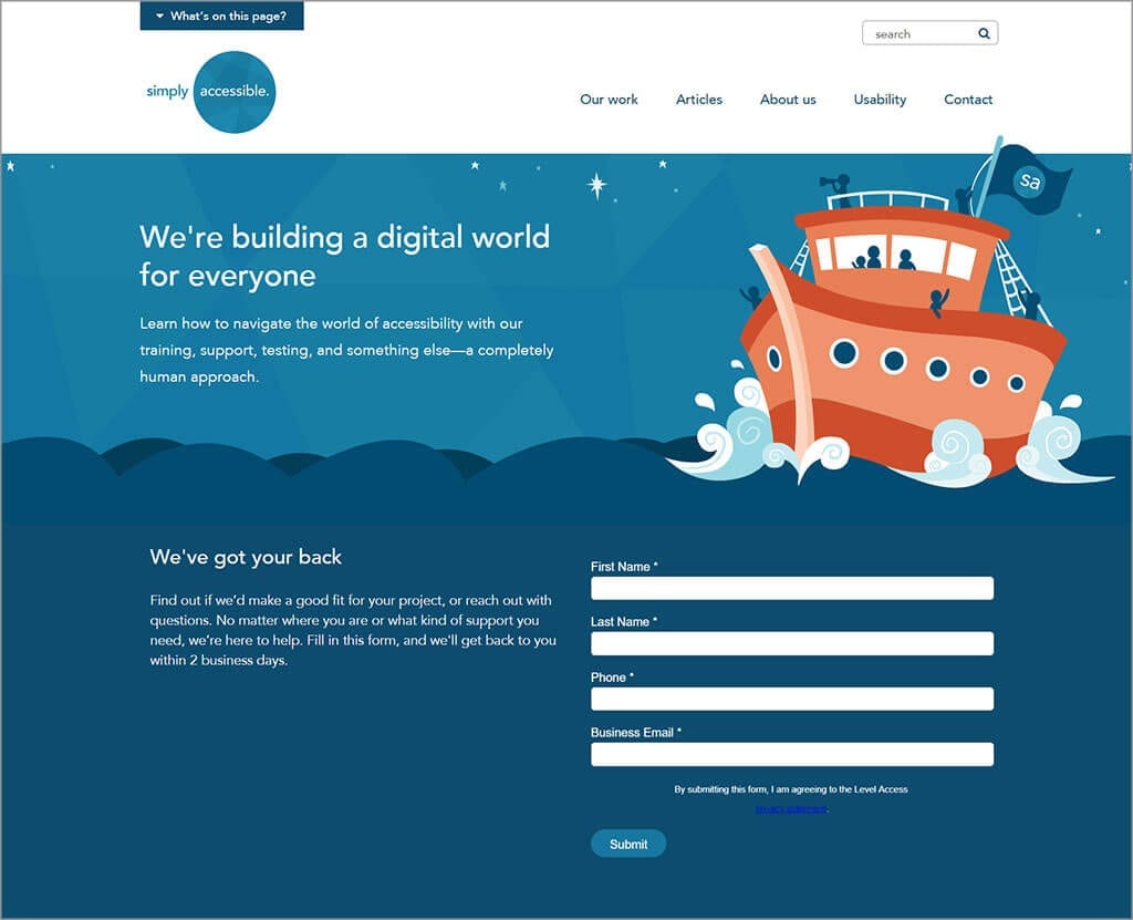
Simply Accessible has done a great job of creating a website showcasing how accessible web design can still be innovative and fun. (Which is a good thing since it’s their business to develop accessible websites!) They feature colour and graphics that are not only fun and whimsical but also easy to read. The focus elements are easily identified when using keyboard navigation and overall it’s a very pleasing, easy to navigate design.
Restaurant websites should absolutely be accessible to all – especially to those like the blind, who have difficulty cooking. The website development plan needs to take into consideration persons who need to be given access to the menu, address and phone number in a format that they can understand.
“This is a whole new area that very few people know about, including Web designers.”
Carolyn Richmond, co-chair of the hospitality practice at Fox Rothschild LLP
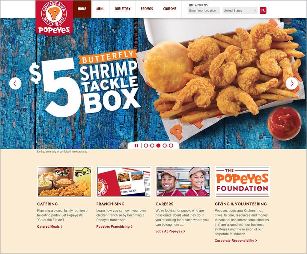
Popeyes US has a site that is well done with minimal accessibility issues. They’ve made a concerted effort to ensure that their site is able to be navigated by everyone.
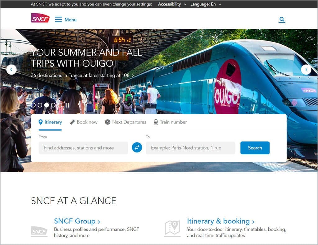
SNCF is labelled as AccessiWeb compliant. Within the top black contrast bar the user has the option to choose different contrast versions of the site. The keyboard navigation is really well designed and overall the site is easy to navigate and understand.
Are there some items that you can’t or shouldn’t use on a website?
Yes, absolutely.
- If you’re still using flash in any way, shape or form, you need to redevelop your site ASAP. Flash was never accessible and support in all major browsers was dropped in 2017. As well it was never supported on any Apple mobile devices.
- HTML 5 Canvas is an extremely creative and powerful tool. It allows for the user to interact with sections of the site and allows data to be drawn – but it needs to be developed properly for it to be entirely accessible. In many cases it needs a lot of extra javascript coding to allow disabled users access to the content. You should be aware of the limitations and the extra development cost this may impose.
- Carousel items can be hard to interpret for the blind – and are even harder if they have interactive items inside of them. If you are going to use them, ensure that you follow all best practices or leave it out entirely.
- Videos without closed captioning should never be used.
- Only use Tables for actual tabular data. Tables are hard to interpret through speech only so you should limit their use as much as possible.
Some website system plugins and modules do not allow for alt tags or allow you to make accessible links. Your website system’s add-on software should be evaluated to ensure it allows the proper level of control.
In the history of web we’ve gone from the extreme of needing to hire professional web developers, to do-it-yourself drag-and-drop web development. We’re now seeing this swing back towards the need for businesses to hire a professional in order to ensure their business website follows all the relevant rules and laws. It’s really not a bad thing either – it insures your site is created properly the first time.
Your website is the face of your business on a local and global scale and it’s so important to put your best foot forward. You should ensure that your site serves more than just the majority audiences and in turn it will grow your business.
Want to know more about accessible web design? Read my last post “Looking at the Web Through Disabled Eyes” or the next post in my accessibility series called “Your Brand VS Web Accessibility Color Contrast Rules“.
If you have any questions or would like to hire us to help you design and develop a fully accessible website, contact us today! 1 (905) 852-2615