Innovative but Inaccessible

Congratulations! You have a plan for an amazing site! You’ve thought of everything… except accessibility.
It’s not your fault, website accessible features are not a priority for many business owners unless they’re specifically catering to people with disabilities. As you go through your site you should be aware of some items that – while they look fantastic – they’re either completely inaccessible, or they are hard to understand.
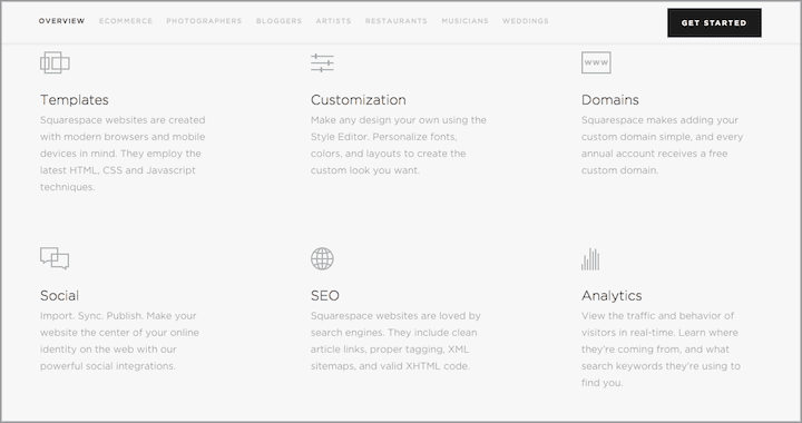
Low Contrast Design.
To the fully sighted it looks absolutely elegant, but to the estimated 8.4 Million* who have visual issues in North America, this is hard – if not impossible to read. There are also other reasons to ensure that you have proper colour contrast on your site. To find out more about color contrast, please see my last post on colour contrast.

Keyboard Accessible.
It’s amazing to me how many large company’s websites don’t function properly using keyboard navigation! Of the estimated 60.5 Million disabled persons in North America, many users depend on only a keyboard to navigate through websites. They navigate using the tab, enter, Page Up / Down, and arrow keys.

Estimated 650 Million Disabled Persons Worldwide
Canada: 3.8 Million
USA: 56.7 Million
Latin America & Caribbean: 50 Million*
Europe: 45 Million
Africa: 80 Million*
Asia Pacific: 400 Million*
*Number is likely higher due to lack of data collection capacity
Amounts of disabled person are based on Census and information of those generally 15 and older, reported to the World Health Organization f rom 2003-2017.
EVERY interactive item (links, videos, forms, carousels, etc.) MUST be easily accessible through keyboard only navigation. It’s helpful to have a skip menu hidden at the top to allow users to move past the main menu directly into the main content of the website (rather then having to navigate through each menu item on each page).
It’s important to remember that any element that can be selected through keyboard interaction, should be able to be moved away from, using only a keyboard. Users should never get ‘stuck’ in an element.
A practical case of this is when a video is used within a carousel. It might seem like a really great way to feature videos, but this can cause some unexpected results when using keyboard navigation or other assistive technology. It’s a good practice to avoid using a multimedia item within another multimedia item.
Obvious Keyboard Focus Indicator.
While using keyboard only navigation, it can be tough to know what item is selected on the screen. Therefore, each element that can be tabbed into MUST have a visible ‘focus’ state indicator that clearly identifies which item is selected on the screen. Some browsers default to a thin grey dotted line, others to a blue solid border.
Focus Order.
As the keyboard-only user navigates the site using the tab button, ensure that the tab key moves the user in a logical order. For example, if the user is filling out a form and the tab key jumps to random form fields instead of moving in a left-to-right top-to-bottom format – it will be confusing to the user. This is called ‘focus order’. In the animation below from the Brit + Co website, the tabbed order moves from one side of the screen to the other, then back again, and completely misses the categories menu item and the search option entirely.

Video Content.
You may think that closed captioning is only for the deaf or hard of hearing. But a study in 2017 found that 77 minutes of YouTube video was consumed at work each day. Many of them watch without the sound on, so this is a great reason to have closed captioning on all your video content.
An even more compelling reason, is that closed captioning increases your video searchability. A study by study in 2017 found that Google indexes closed captions uploaded to YouTube videos, which makes them more likely to rank higher in searches for relevant keywords.
Canvas:
This element gives you a drawing space in JavaScript on your webpages where developers can create just about anything. It can add images or tooltips or create dynamic graphs on your webpages, all built on the fly.

It can help create extraordinary interactive experiences like the Wine Explorer from Brancott Estate website (which has now been taken down). While canvas has support in all browsers and will render on the screen, any text rendered inside of canvas becomes an image — meaning it’s inaccessible to screen readers. Some complain that this is the least accessible thing to be put on the web since Flash.
Unfortunately there’s no way to clearly mark objects and actions, even using Web Accessibility Initiative’s Accessibility for Rich Internet Applications (WAI-ARIA). If using Canvas on your website, it’s generally a good idea to follow conventional accessibility guidelines such as ensuring keyboard access, not relying on colour alone to signify an interaction and providing clear instructions for user interactions. A certain amount of accessibility can be added with JavaScript, ARIA labels and/or fallback content placed within the element.
In some cases Scalable Vector Graphics (SVG) is a better choice for interactive content and custom controls as it has internal accessibility semantics and the ability to add interactivity with JavaScript.
| SVG | Canvas |
|---|---|
| XML-based vector image format for interactivity | HTML element that draws bitmap graphics on the webpage |
| Flexible and can expand beyond its natural size | Images are not very flexible |
| Supports event handlers | No support for event handlers |
| Not suited for gaming applications | Well suited for gaming applications |
Because canvas applications can be so different from project to project, the accessibility will be different for each project. If the canvas is only reproducing 2D graphics, such as a bar chart, a simple alternative text will do. Whereas a more complicated item may need a significant amount of work – or may not even be possible to be made accessible.
Complex Graphics with large amounts of information
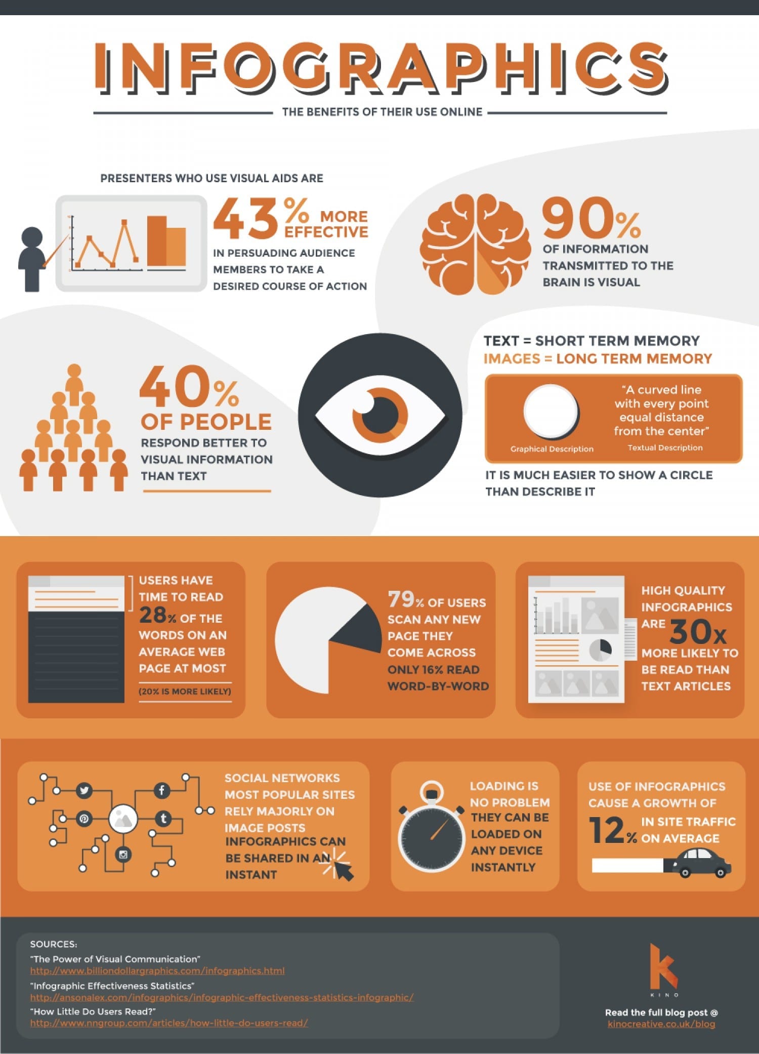
The public has LOVED these large infographics. They help graphically depict large amounts of data in easy to understand format. So what’s the issue? Well these graphics are usually created as .jpg, .png and other solid graphic formats, which means the only way it can be understood in a non-visual way is by way of the alt tag. It’s important to understand that infographics are not natively accessible. In the example below the alt tag was “Infographics – The Benefits of Their Use Online Infographic”. With a limit of 125 characters, alt tags cannot inform the user of this whole graphic. If there is nothing else on the page, to help give understanding of the graphic a visually impaired user is left without any idea of what the image was meant to convey.

Complex graphics should either have a full text alternative explanation above, or below or be re-created in some textual format within the main content of the site. Adding this live text is also a great way to increase your SEO and your searchability.
We’re amazing at pushing the boundaries of what is possible on the web. But with this exploration it’s important that we don’t leave out the millions of people that are unable to experience websites in a traditional sense. With planning and testing you’ll end up with a site that not only serves everyone, but also heightens your sites search performance.
Want to know more about accessible web design? Read my post “Your Brand VS Web Accessibility Color Contrast Rules” or the next post in my accessibility series called “Accessible Navigation“.
If you have any questions or would like to hire us to help you design and develop a fully accessible website, contact us today! 1 (905) 852-2615
* Number as reported in 2018 from the US National Defense of the Blind and Canadian National Institute for the Blind. Note that these numbers are expected to double by 2050.