Does your web site get in the way of a great user experience?

Here’s a thought. Users expect website design to meet their needs in every possible way leaving no room for error. And when a site doesn’t deliver to those expectations, they choose a different experience (wait for it) …… someone else’s website. A site that is seamless for the user can build trust, deepen engagement, and even drive brand awareness.
Unfortunately, in spite of placing more emphasis on the user as the focal point of website design, many companies still fall victim to a few myths that get in the way of the users optimal experience.
In through the front door
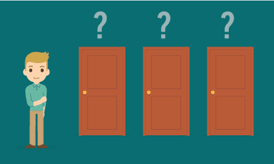
The homepage is often considered the digital equivalent of the front door or entry point and as a result is given a tremendous amount of thought and design attention. But be careful, you can’t assume users come to your site on their own—and necessarily land on your homepage.
To begin, have a look at your site data. You might discover that let’s say, only 30% of site landings are on the homepage while product and content pages may account for 23%, and other pages accounted for 47% of site landings.
Therefore, you should consider treating every page as if it’s the homepage. After all, search engines and social media sites often send users to specific pages on your site. If you want those users to stick around, you need to guide them deeper into your site content.
As a result, you’ll need to make sure those pages are not a dead-end; otherwise, users will leave. Make sure your designers understand that shopping and learning are not necessarily linear processes and to offset dead ends consider introducing promos and content teasers to showcase related articles and products.
The hamburger menu
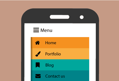
A hamburger menu or hamburger icon is a name given to the menu icon found websites that hides the traditional File menu. Alternatively referred to as the hotdog menu or three-line menu, using the hamburger menu makes it easier to view program options on mobile devices.
Those three horizontal lines in the corner of some websites supposedly optimized for small screens. The hamburger remains a go-to, even though many users don’t recognize it for what it is! So why still use it?
Hamburger menu enthusiasts will claim that it’s a low-profile solution that makes it an ideal navigation approach for mobile, but what it really is a crutch that allows designers to skip editing all the navigation options. It’s the digital equivalent of quickly throwing everything into the closet before guests arrive.
To find out if a hamburger is right for your site, conduct a quantitative navigation test. In a recent test we conducted on a site, the non-hamburger option performed 211% better than the hamburger menu. You may find that the hamburger menu may in fact confuse most participants. You may find that it is far more helpful to use prioritized and (at least partially) exposed navigation to help users get where they need to go.
The search myth
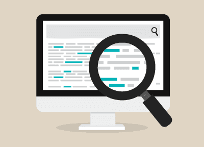
Designing and building a great search experience takes time and effort. However, if a visitor doesn’t quite know what they are looking for, search isn’t helpful at all.
A great filtering approach that showcases the contents of your site in the user’s language and lets the user quickly narrow them down to find what they are working for.
With the proliferation of bad search experiences, a great search experience can be a competitive advantage. Just by following Google-like patterns and removing a combo search-filter area that was prohibiting users from accessing content in a natural way can go a long way to significantly increasing a user conversion.
Avoiding search pitfalls requires an honest evaluation of how important search is to the user. Will great filters suffice? If not, and search is truly required, it is imperative to build an experience that’s as frictionless as possible.
It is easy to think that your site is getting in the way of a good and useful user experience, but looking through data and conductive both quantitative and qualitative testing with users will help to overcome and diagnose the website issues that stand in the way of the best user experiences.
Also published on Medium.