Checklist of common mobile mistakes. Part 2

Performance Testing
It’s 2018! The mobile phenomenon should not be a big surprise anymore. In fact, it’s a way of life. If your website is not fully optimized for mobile search, you need to change things. In part two of this two part series we’ll explore a few practical tips you can do to optimize and test your site performance for mobile users.
1. You’d think by now that responsive design is being used by everyone.
Sadly, it’s still not the case. If your website still isn’t responsive, make it your goal to do so this year.
Non-responsive websites simply do not rank as well (if at all!) in mobile search.
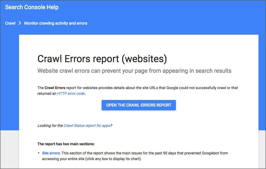
2. You’re not routinely checking for crawl errors.
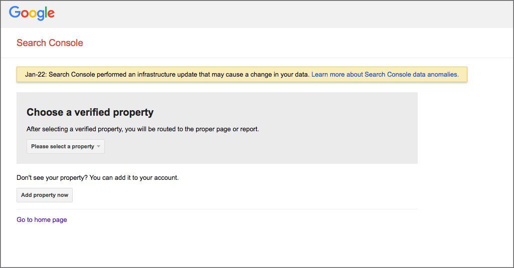
Sometimes, mobile SEO issues are easy to spot and fix. One thing you should be doing on a routine basis is checking your mobile crawl reports. Here’s how. Go to the Google’s Crawl Errors reports page, and click “open the crawl errors report.”
Select your property from the dropdown menu.
See if you have any errors.
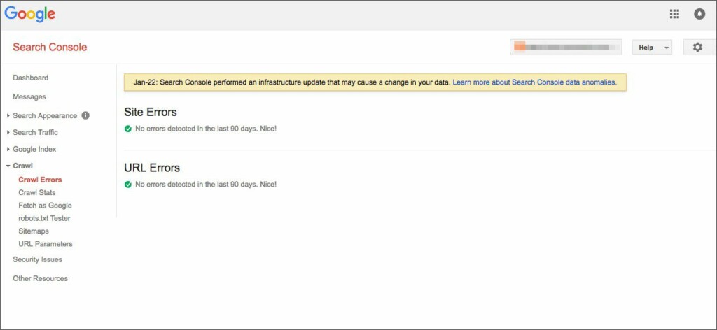
If you don’t have any errors, pat yourself on the back.
3. If you do have errors, Google will provide suggestions as to how you should fix them.
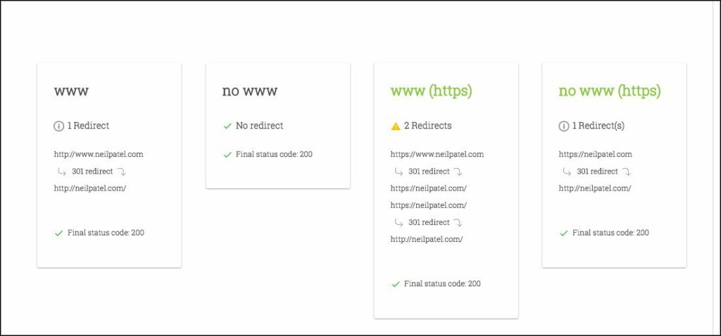
One such error has to do with URLs and redirects. In the age of responsive design, mobile redirect errors aren’t as much of a problem as they used to be.
Occasionally, they do come up. Scan your website with a redirect mapper tool, like this one from Varvy.
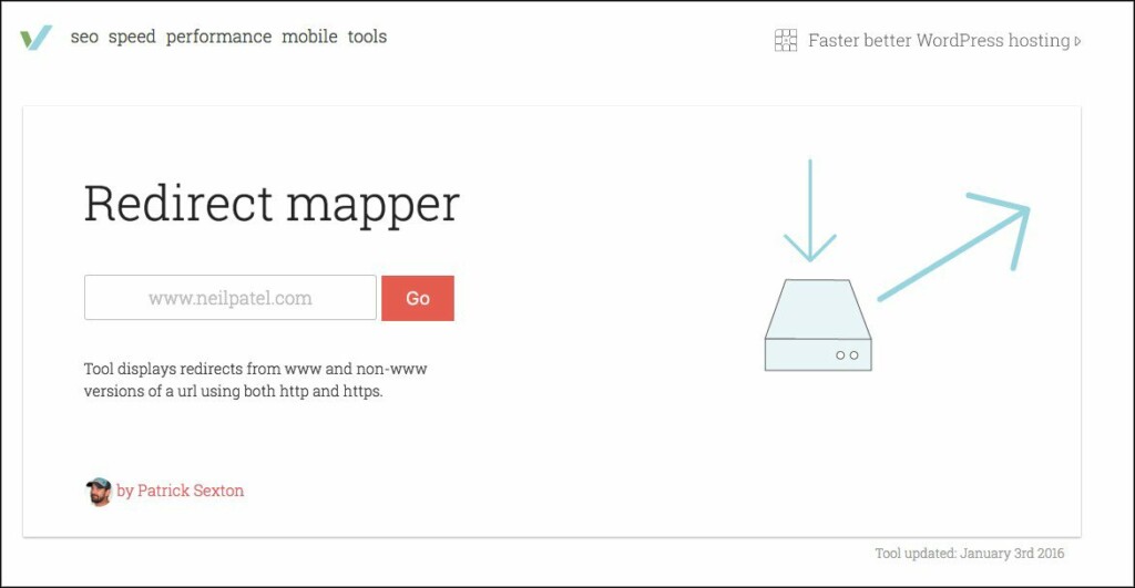
You’ll gain a clear sense of where the errors are, and how to fix them.
4. You’re serving a 404 to mobile users trying to access a URL.
Everyone hates 404s. But when they happen on mobile, it’s particularly frustrating.

Checking the crawl errors report (above) is the best way to spot mobile 404s, and fix them as they come up. Again, this is usually a problem for non-responsive sites.
If you are using a mobile-only site but don’t have a corresponding page for mobile devices, then make sure you’re directing users to the desktop page instead of a 404 page.
5. Your mobile pages take more than one second to render.
Mobile users are impatient, and Google takes their side. If your mobile website takes more than a second to load, you are frustrating your users and possibly receiving lower rankings.
You can test the speed of your website using Google’s PageSpeed insights. Put your URL in the field, and click “Analyze.”
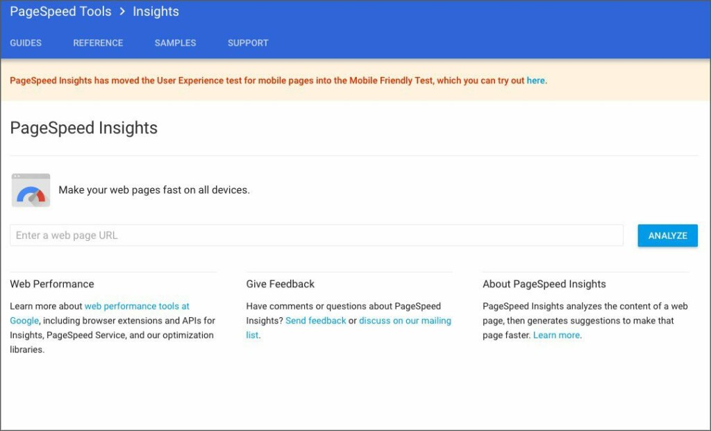
Google provides helpful instructions for improving site speed, however, they don’t give a report of your page speed in seconds. To get your page speed in seconds, use Pingdom’s Website Speed Test.

Enter your URL and select a test location (preferably the location closest to you).
Click “Start Test,” and then view the results.
6. You haven’t thought about accelerated mobile pages.
Accelerated mobile pages were all the rage a few months ago. It’s important to consider using AMP for your mobile site. Why? Simple. AMP-optimized pages will load faster on mobile, and they tend to rank better. However, you should not automatically assume that AMP is necessary for your website. AMP sites tend to minimize the user experience in favor of quick load time. That’s great for sites with regular content delivery, such as a news site. If your goal is a more engaging, immersive, and interactive experience, you may not want to use AMP.
7. The best way today to get an accurate report of all your mobile issues, is to use Google’s mobile friendly test.
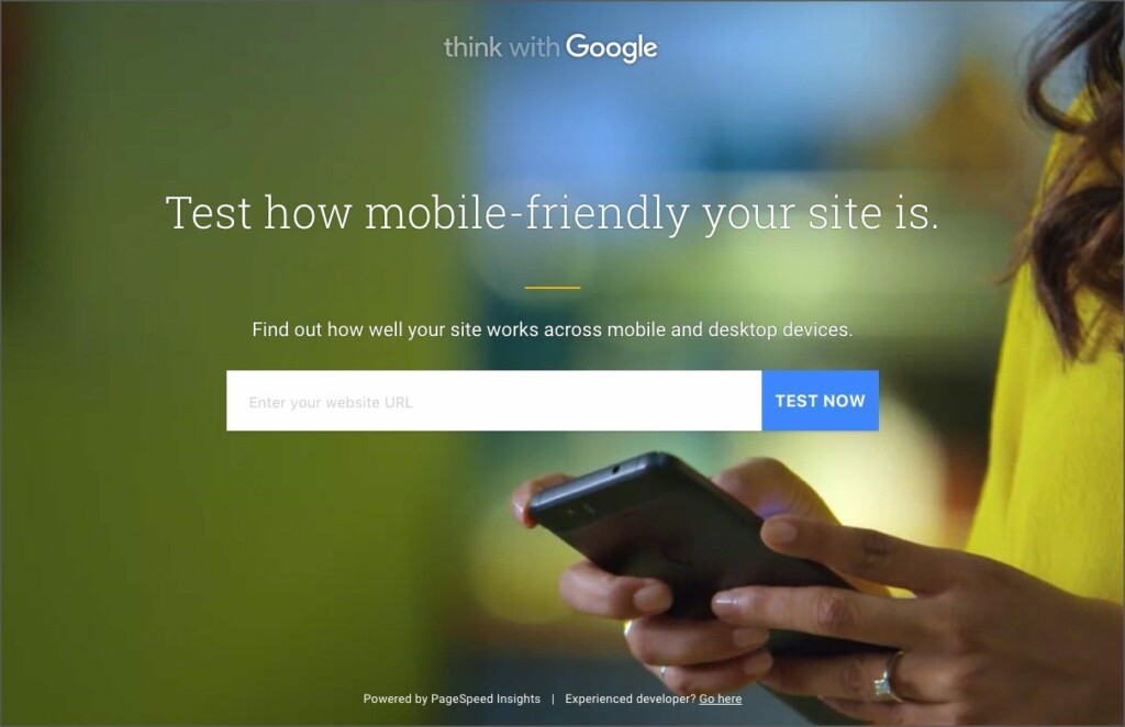
The test takes just a few seconds to run.

You can review an easy-to-understand report. They provide you with a mobile-friendliness score, which is a helpful way to understand your site’s overall mobile usability. Most web designers, developers, and SEOs today are able to create mobile-optimized sites with no problem. But occasionally, you’ll encounter one of those thorny SEO issues that perhaps you forgot about or that randomly came up. Always be thinking mobile. Test your site. Use your site on mobile. Look for issues. The more you do, the more you’ll be aware of problems and know how to fix them.
For a FREE consultation and mobile site analysis or to learn more about optimizing your mobile site performance call MyBrotherDarryl. 905-852-2615