Checklist of common mobile mistakes. Part 1

SEO and optimizing mobile content.
It’s 2018! The mobile phenomenon should not be a big surprise anymore. In fact, it’s a way of life. If your website is not fully optimized for mobile search, you need to change things. In part one of this two part series we’ll explore a few practical tips you can do to optimize your content for mobile users.
First, you can’t ignore the way people read content on mobile devices. Take this little statistic into account. In the U.S., people spend most of their total digital media time on a mobile device — about 2.8 hours per day.
Second, what are they doing on their mobile device?
They choose to check the weather, read the newspaper, and keep up with sports on their mobile device. In other words, they’re interacting with a lot of content. Much of this content could be videos or images, but they also interact with a lot of written content. When it comes to reading news, specifically, take a look at which websites/apps people prefer:
Here’s a half a dozen or so of practical things you can do to optimize your content for mobile users.
1. Use a large, comfortable font for the body of your content. You want people to read your content without squinting. Typecast recommends a minimum of a 16px font for mobile readers.
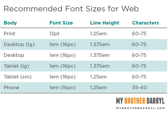
Recommended Font Sizes for Web
Print – Font Size: 12pt, Line Height: 1.25em, Characters: 60-75
Desktop (large) – Font Size: 1em (16px), Line Height: 1.375em, Characters: 60-75
Desktop – Font Size: 1em (16px), Line Height: 1.375em, Characters: 60-75
Tablet (large) – Font Size: 1em (16px), Line Height: 1.375em, Characters: 60-75
Tablet (small) – Font Size: 1em (16px), Line Height: 1.25em, Characters: 60-75
Phone – Font Size: 1em (16px), Line Height: 1.25em, Characters: 60-75
2. Don’t go overboard on your font size for the headline. If you make your headline too large, it’s going to fill the whole screen. People will have to scroll to see the first line of your content.

Try to avoid that. Instead, make your headline small enough so people can see it and the opening content or image at the same time. Like this:

3. Break it up with white space. Mobile users need white space for their eyes to rest, and for their mind to gain clarity. Use plenty of white space in your content. The easiest way to do this is by writing short paragraphs. Have you ever noticed that my paragraphs are rarely longer than three lines even on mobile?
4. Break it up with headings and images. Headings and images both help to break up your content. Use them. Mobile readers behave differently from non-mobile users when interacting with content. They scan. They skim. They skip. They save for later. Adapt to their needs by creating your content with this style in mind. You’re optimizing according to traditional keyword research, not mobile keyword research.
5. It should not come as a surprise to most people, but keyword research for mobile and for desktop should be different. This makes sense when you think about it. When searching on mobile device, these things are true:
- People make typos easier.
- People try to type shorter queries if possible.
- Often, people speak their queries rather than type them.
- People search for different things on mobile (e.g. a local restaurant).
The most important thing to keep in mind is that mobile searchers are sometimes speaking instead of typing. Instead of doing traditional keyword research, think about keyword research terms of mobile search practices such as these:
- Conversational phrases
- Questions
- Full sentences
How should you do your keyword research? If you use Google Keyword Planner, be sure to click on “Show ideas and statistics for…All Mobile Devices.”
6. Your calls to action are tiny. One major usability error that has SEO impact is tiny calls to action (CTAs.) You’ve probably seen mobile buttons that look like the tiny ones at the bottom of this screen:
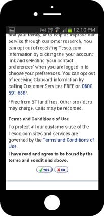
That doesn’t work. The average mobile user’s finger will cover both of those buttons! We recommend making mobile buttons the full width of the screen.
You can’t ignore the way people read content on mobile devices. The simple fact of matter is that mobile has become a way of life. Fixing simple SEO tactics is a good first step to connecting with your mobile audience.
Contact MyBrotherDarryl for a FREE consultation and review of your mobile web site. 905-852-2615
In part 2 of this series we’ll explore mobile performance and testing tips.